| Author | Thread |
Comments Made During the Challenge  |
|
|
06/04/2006 05:24:03 AM |
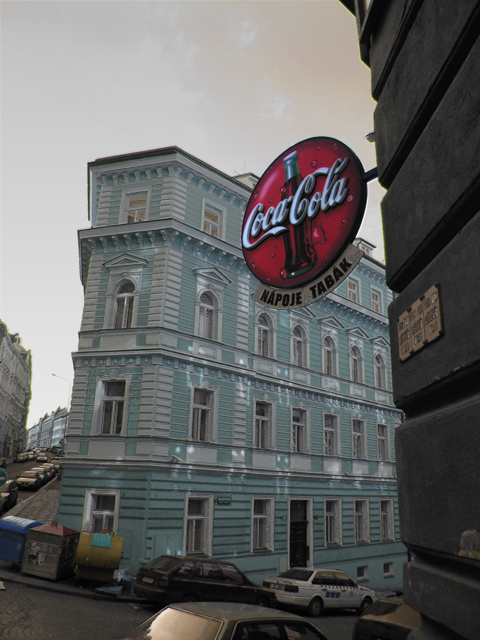
| I would have liked this image more with a tighter crop losing the cars and the trash bins from the bottom of the image. |
|
|
|
06/03/2006 09:19:03 PM |
| I live for Coke so this gets an extra point even though the focal point is the sign and not the architecture. |
|
|
|
06/03/2006 07:49:07 PM |
| Prague is packed with magnificent architecture. Although this is a nice building it pales in comparison with the best. The lowest half of the picture is distracting, I think that cropping it off might help. |
|
|
|
06/02/2006 03:23:14 PM |
| this picture seems like it is more about the coca cola sign than the architecture behind it, which i think is what you are trying to show. |
|
|
|
06/02/2006 11:22:56 AM |
|
|
|
06/02/2006 09:33:27 AM |
| A tighter crop on the sign and the interesting building across the street would have made this a great photo. The side street pulls the viewer's eye away from the main subject and makes the picture seem busy. |
|
|
|
06/01/2006 09:41:05 PM |
| Even though your buildings have converging lines this photo is still well composed... surprising - the Sign helps provide a good POI and draw attention from the buildings. Good job. (7) |
|
|
|
05/30/2006 08:15:47 AM |
| I love flatiron buildings; and you cought a neat feel here. I like how the street winds around. |
|
Home -
Challenges -
Community -
League -
Photos -
Cameras -
Lenses -
Learn -
Help -
Terms of Use -
Privacy -
Top ^
DPChallenge, and website content and design, Copyright © 2001-2025 Challenging Technologies, LLC.
All digital photo copyrights belong to the photographers and may not be used without permission.
Current Server Time: 03/12/2025 03:30:35 PM EDT.