| Author | Thread |
|
|
06/06/2006 02:51:58 PM |
*** C R I T I Q U E C L U B C O M M E N T ***
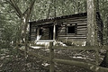
While this image is definitely "of" architecture (it meets the challenge) It unfortunately has little to recommend it as a photograph. Let me see if I can explain why:
1. First and foremost, architectural subjects really cry out for what I call the "definitive light". Here, the light is so flat and even that we have no sense of either texture or 3-dimensionality.
2. The colors are drab and lifeless. This can be corrected in PP to a great extent.
3. The composition is extremely awkward. It feels tight and cramped, and we have a sense of important pieces being left out: this is especially true at the bottom, where the fretwork under the bay window is hinted at but not expressed. See also where the roofline is cut off on the left, and how the little "L" in the roofline on the right is not fully expressed; it just needs more breathing room all around.
Thius is a lovely subject, and you could definitely make an appealing image out of it if you went back at the right time of day :-) |
|
 Photographer found comment helpful. Photographer found comment helpful. |
Comments Made During the Challenge  |
|
|
06/03/2006 08:31:01 PM |
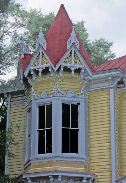
| This image seems over processed to me as it appears "flat" and lacking depth. |
|
| Photographer found comment helpful. |
|
|
06/01/2006 06:15:52 AM |
| shame about the picture it looks a bit washed out !! |
|
| Photographer found comment helpful. |
|
|
05/31/2006 10:15:59 PM |
| needs more contrast. Nice lines. |
|
| Photographer found comment helpful. |
|
|
05/30/2006 01:22:11 PM |
| out of focus, a bit grainy ... awesome house though! |
|
| Photographer found comment helpful. |
Home -
Challenges -
Community -
League -
Photos -
Cameras -
Lenses -
Learn -
Help -
Terms of Use -
Privacy -
Top ^
DPChallenge, and website content and design, Copyright © 2001-2025 Challenging Technologies, LLC.
All digital photo copyrights belong to the photographers and may not be used without permission.
Current Server Time: 03/17/2025 01:25:55 AM EDT.