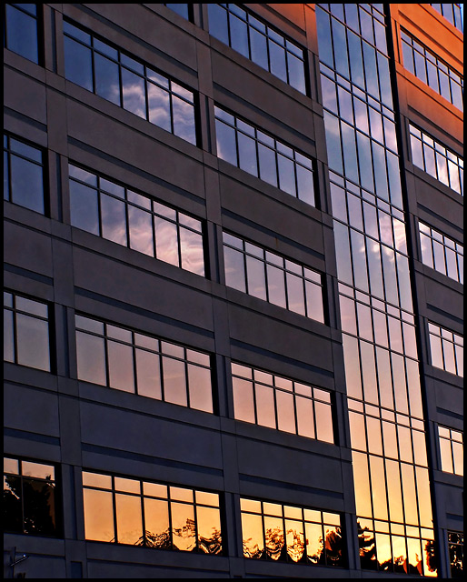
Yeah, I confess, I found a way to squeeze a sunset into the challenge :-P ...But hey, I think it works, and that's my story and I'm sticking to it! Anyways, yeah, pretty obvious, going for the sunset reflection thing. I thought it actually stresses the use of all that glass in the architecture of this building. Also, trying to make use of all those lines in the composition. Leading lines and repetitive lines. Also, I thought the right angles created a little tension to highten the interest factor. As well as the difference between the glass and concrete and metal structure against the reflected sky and clouds and color from the sunset. Or, maybe I'm just full of crap :-P I guess the voters will decide, ey?
So, in ps- neat image, crop, levels, curves for midtone contrast, curves for color balance, hue/sat adj, cloned out a couple of small lights showing from inside the building, a little dodge and burn on the clouds, a multiply layer with the opacity dropped, a little more levels tweaking, smart sharpen, resized, border, sfw
Thanks for checking out my pic :-)
Statistics
Place: 141 out of 281 Avg (all users): 5.5528 Avg (commenters): 7.0000 Avg (participants): 5.4857 Avg (non-participants): 5.6277 Views since voting: 748 Views during voting: 267 Votes: 199 Comments: 7 Favorites: 0
I like the title; it improves the shot- makes you think and makes the shot more interesting; but what is truly nice is the simple composition with the reflected sunset.