| Author | Thread |
Comments Made During the Challenge  |
|
|
06/01/2006 11:31:40 PM |
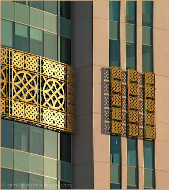
| Great minimalist approach! The cropping really accenuates the architectural details. I love the shadows cast by the designs on the righthand side. The exposure looks good. My only advice is that the colors seem to have an overall warm cast - perhaps it could be cooled down. |
|
 Photographer found comment helpful. Photographer found comment helpful. |
|
|
05/30/2006 12:37:13 PM |
| I like that your subject shows contrast while connecting itself; the pattern is difference from the normal windows and yet they are both of the same shape and size. Crisp, clear... contrasting colors. I would have enhanced contrast more. |
|
| Photographer found comment helpful. |
|
|
05/29/2006 04:55:28 PM |
| Nice shot, the sun really lights it up. |
|
| Photographer found comment helpful. |
|
|
05/29/2006 03:04:08 PM |
| Doesn't look to be quite in focus. |
|
| Photographer found comment helpful. |
|
|
05/29/2006 04:34:54 AM |
| Nope, it's not doing anything for me. It's very uninteresting. |
|
| Photographer found comment helpful. |
Home -
Challenges -
Community -
League -
Photos -
Cameras -
Lenses -
Learn -
Help -
Terms of Use -
Privacy -
Top ^
DPChallenge, and website content and design, Copyright © 2001-2025 Challenging Technologies, LLC.
All digital photo copyrights belong to the photographers and may not be used without permission.
Current Server Time: 03/18/2025 04:40:38 AM EDT.