DPChallenge: A Digital Photography Contest You are not logged in. (log in or register
 
Challenge Entries
Portfolio Images
This image is not part of a public portfolio.
French Chalets
French Chalets
Tej


Photograph Information Photographer's Comments
Challenge: Architecture III (Advanced Editing IV)
Camera: Olympus C-70 / C-7000 Zoom
Location: India
Date: May 22, 2006
Aperture: 4.0
ISO: 80
Shutter: 1/40
Galleries: Still Life, Architecture
Date Uploaded: May 28, 2006

PP-

- Cropped
- Levels
- Dragonized
- Some burning at the bottom corners
- Hue-Saturation
- Saved for Web
- NeatImage with some Sharpening

Statistics
Place: 211 out of 281
Avg (all users): 5.1813
Avg (commenters): 5.8000
Avg (participants): 5.0400
Avg (non-participants): 5.3537
Views since voting: 801
Views during voting: 242
Votes: 182
Comments: 8
Favorites: 0


Please log in or register to add your comments!

AuthorThread
06/06/2006 04:28:40 PM
Greetings from the Critique Club!

First impression: nice colors, but are they real?

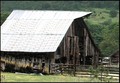
The sky is gray, almost too gray to produce such red color. It may not be true, and I won't go into the game of guessing how did you do it, I'll just comment on the impact the photo makes on me. It almost looks like a drawing. The more I look at it, the more it draws my attention. And that is positive in this case. My eyes are exploring the details, but fail to find something to catch on. The details on the roof are lost in places, and that ruins the photo for me a bit.

Then I read your comments for a second observation. You used grunge effect on it! Weird choice for an architecture shot:-)

The details I mentioned above were probably lost because of the extensive postprocessing, including NeatImage. To score better here at DPC (and I think that you scored right where I would expect this image to score, in lower 5s), you need to have a wow-factor. In the architecture challenge, you should have known that 90% of the submissions are going to be buildings. So, you needed to figure out the way to make yours stand out. You picked a standard, centered composition, without a lot of space around the building. Then you applied draganizer action, and that is another polarizing technique - some people love it and some hate it. I like it applied on people, but have a hard time finding a good landscape or architecture application for it. In the end, after going through 100s of entries, this one will not be remembered, and will receive scarce bumps.

I hope this helps, and good luck in the future challenges.

If you have any questions regarding this critique, please feel free to PM me.

-Serge

 Comments Made During the Challenge
06/03/2006 08:10:51 PM
Cropping off the piece of left chalet would make the composition better and eliminate the overexposure of the window reflection.
  Photographer found comment helpful.
06/02/2006 02:49:53 PM
bad sky.. curse the weather!
  Photographer found comment helpful.
05/31/2006 10:06:19 PM
Great Shot!
  Photographer found comment helpful.
05/31/2006 11:33:16 AM
Interesting contrast. However, it seems a bit over saturated over sharpened. I like the comp and the cool sky.
  Photographer found comment helpful.
05/30/2006 05:06:45 AM
Nice house, but it seems a bit oversharpened and oversaturated. The sky looks out of place with the light on the trees.
  Photographer found comment helpful.
05/29/2006 12:29:25 PM
Too blown out.
  Photographer found comment helpful.
05/29/2006 05:35:59 AM
Different....7
  Photographer found comment helpful.


Home - Challenges - Community - League - Photos - Cameras - Lenses - Learn - Help - Terms of Use - Privacy - Top ^
DPChallenge, and website content and design, Copyright © 2001-2025 Challenging Technologies, LLC.
All digital photo copyrights belong to the photographers and may not be used without permission.
Current Server Time: 03/18/2025 03:32:33 AM EDT.