| Author | Thread |
|
|
06/06/2006 04:41:29 PM |
Greetings from the Critique Club
My first impression is "Wow!" great duotone job ;)
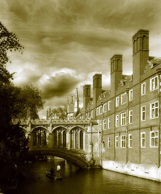
What really inspires about this image is the textures created by not only the building in itself with her intricate detaiuling but also the skies. Those are angry clouds reminiscent of Ansel Adams. I love angry clouds as they have so much life in them. The duotoning works well in this image and aptly titled, makes for a strong image. The lower left hand side is a bit dark even in my bright monitor. I assume a bit of highlight and shadow would do the trick. The building in itself is good with the parallels in line but a bit soft IMHO. I would personally prefer a bit of sharpening here. The people add visual interest and scale which is appropriate for this type of image ;)
Overall, I like the image a lot. It shows a great regard for composition and color rendition. If you have any questions or comments regarding this critique, please do not hesitate to PM me. Thanks and good luck.
Cheers,
Rikki
|
|
Comments Made During the Challenge  |
|
|
06/04/2006 03:03:36 PM |
| Nice antiqueing. truely gives an old photo feel. I think this was executed very well. Would have to say the best one yet. |
|
 Photographer found comment helpful. Photographer found comment helpful. |
|
|
06/04/2006 11:12:50 AM |
| Nice sepia tone - appropriate to a place with so much history. When I was in Cambridge - I was frustrated by the shadows that fell on this bridge. You have tried to emphasize it by putting it on the thirds line and that does make a nice composition, but the bright lighting on the college draws the eye away from that wonderfully detailed bridge with its details in the shadows. Great sky though! And I like the detail of the punt in the water and the punter with a white shirt helps us to see him. Maybe a bit of doging in the shadows on the bridge, or a judicious use of curse to pull the details out a bit. |
|
| Photographer found comment helpful. |
|
|
06/04/2006 06:58:52 AM |
| Nice image. IMHO I am not a fan of sepia. It dulls the senses in this case. |
|
| Photographer found comment helpful. |
|
|
06/03/2006 07:12:08 PM |
| Detail is stunning, wondering what it would look like in more traditional B&W tones. |
|
| Photographer found comment helpful. |
|
|
06/02/2006 12:56:27 AM |
| Nice tone for this old structure. Very nice |
|
| Photographer found comment helpful. |
|
|
06/01/2006 08:39:00 PM |
| The sepia does this picture well. I like how it makes the sky look dark and foreboding. |
|
| Photographer found comment helpful. |
|
|
06/01/2006 03:24:03 PM |
| Love the sepia tones, the sky almost looks unreal! The shot feels very charged/emotive. 9 |
|
| Photographer found comment helpful. |
|
|
05/30/2006 08:23:24 PM |
| the aged/almost antique feel this photo has is nice and unique |
|
| Photographer found comment helpful. |
|
|
05/29/2006 02:31:04 PM |
| sky seems a bit flat to me |
|
| Photographer found comment helpful. |
|
|
05/29/2006 10:00:50 AM |
| Beautiful choice of color for this photo, it really makes it feel vintage. Exposure is perfect even though it would be hard as there is a few stop difference between the left and right sides. You managed to keep some detail on the left without blowing out the white near the water on the right. The sky is wonderful. Darn you GREAT IMAGE. I think I have to give it a 10 technically, a 10 stylistically. I guess the average of two 10s is 10 |
|
| Photographer found comment helpful. |
|
|
05/29/2006 02:55:35 AM |
| Seems some have trouble moving on....8 |
|
| Photographer found comment helpful. |
|
|
05/29/2006 12:47:41 AM |
|
| Photographer found comment helpful. |
|
|
05/29/2006 12:42:57 AM |
| The vintage colonial look is really neat. |
|
| Photographer found comment helpful. |
Home -
Challenges -
Community -
League -
Photos -
Cameras -
Lenses -
Learn -
Help -
Terms of Use -
Privacy -
Top ^
DPChallenge, and website content and design, Copyright © 2001-2025 Challenging Technologies, LLC.
All digital photo copyrights belong to the photographers and may not be used without permission.
Current Server Time: 03/18/2025 06:17:54 PM EDT.