| Author | Thread |
|
|
06/06/2006 01:03:35 PM |
** Greetings from the Critique Club **
What a wonderful image to get to critique!
Technicals first:
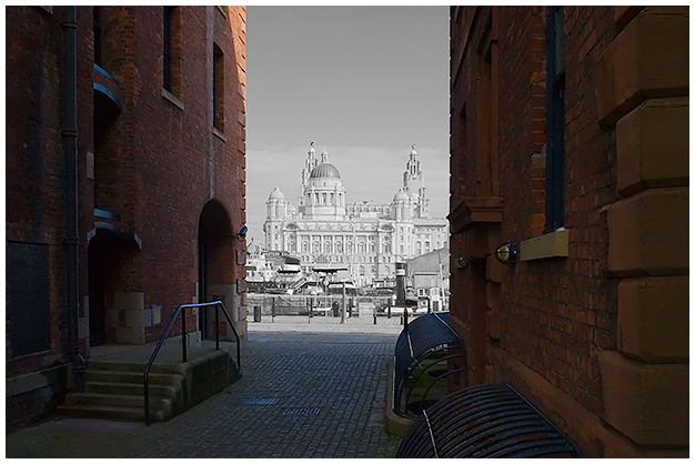
Lighting and exposure seem well thought out and executed.
The composition is really good as you made sure you were not centered in the alley, giving this a nice perspective.
Focus seems just a bit soft. I would have liked to see sharper details in the buildings that you left in color. The bricks should have some nice shadows, cracks, and crevices. Using the burn tool can bring out the shadows, but you would need a bit of USM to bring out the textures.
The selective desat is well executed in my mind. You chose the perfect point to begin the desat. On the desaturated areas, you might consider boosting the contrast as the building do seem to lack seperation from the sky.
Overall, I really like the image and the post-processing you aplied here. Good luck in future challenges. I look forward to seeing more of your work.
- Linda (ShutterPug)
|
|
 Photographer found comment helpful. Photographer found comment helpful. |
Comments Made During the Challenge  |
|
|
06/03/2006 08:14:40 PM |
| Very interesting. The background looks monochromatic. |
|
| Photographer found comment helpful. |
|
|
06/03/2006 05:57:40 PM |
| I see the past but I don't see the future. You should chosen a much more futuristic building. |
|
| Photographer found comment helpful. |
|
|
06/03/2006 09:10:33 AM |
| tis is one of the rare occasions where selective desaturation works well - however the image on the whole looks a bit dull |
|
| Photographer found comment helpful. |
|
|
06/02/2006 03:14:27 AM |
| nice concept and executed well |
|
| Photographer found comment helpful. |
|
|
06/01/2006 10:26:21 PM |
| Great selective desat here. As an improvment, I would probably concentrate on the contrast and highlights in the BW portion of the photo ;) Right now, the sky and the building are almost the same color renditions ;) (6) |
|
| Photographer found comment helpful. |
|
|
05/31/2006 10:17:15 PM |
|
| Photographer found comment helpful. |
|
|
05/31/2006 09:35:41 AM |
| Good idea to use selective desaturation. It's a bit harsh and abrupt, though. Perhaps it would have been less so if you had left just a hint of color, 10% or so? |
|
| Photographer found comment helpful. |
|
|
05/30/2006 07:46:44 PM |
|
| Photographer found comment helpful. |
|
|
05/30/2006 07:44:46 AM |
| Nice idea, perhaps the back and the foreground of the black and white is to detailed, losing the depth; but I like the composition otherwise. good luck. |
|
| Photographer found comment helpful. |
|
|
05/30/2006 02:29:58 AM |
| Nice Contrast. Amazing effect. |
|
| Photographer found comment helpful. |
|
|
05/29/2006 04:57:25 PM |
| Very interesting, I really like it good luck. 8 |
|
| Photographer found comment helpful. |
|
|
05/29/2006 12:51:24 PM |
|
| Photographer found comment helpful. |
Home -
Challenges -
Community -
League -
Photos -
Cameras -
Lenses -
Learn -
Help -
Terms of Use -
Privacy -
Top ^
DPChallenge, and website content and design, Copyright © 2001-2025 Challenging Technologies, LLC.
All digital photo copyrights belong to the photographers and may not be used without permission.
Current Server Time: 03/12/2025 03:14:27 AM EDT.