| Author | Thread |
|
|
06/06/2006 04:19:56 PM |
Greetings from the Critique Club
First of all, congratulations on a great start and welcome to the madness that is DPC ;) Architecture has been a passion of mine for a long time and I got into photography because of my love for architecture.
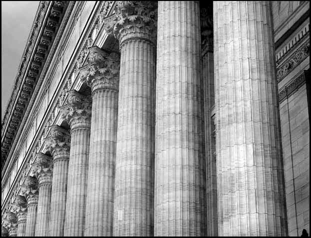
Your composition shows great promise of better things to come. The choice in subject is excellent. There is nothing more dominant than using columns - classical ones at that too. The use of BW for this image is good but needs some improvment. The re really isn't much definition in terms of what is gray to white to black. I would suggest experimenting with the channels filters in PS. A common issue in photographing architecture is parallax or the convergence of the parallels. since this was an advanced editing challenge, perspective correction is allowed. I would have used this to your advantage and corrected some of the misleading parallels. This is really evident on the right side of the frame. A bit of sharpening could also be used (maybe even selective) at the corinthian capitals. They appear a bit soft. Finally, since you used some burn on the image, I would push it up just a notch specially between the columns so the difference between the columns and the background stands out.
As far as your first entry is concerned, great job and congrats to you. This was certainly one great image that you should be proud of ;) Keep up the good work and I'm sure, we'll see more of your great work in the near future.
If you have any questions or comments regarding this critique, please do not hesitate to PM me. Thanks and good luck.
Cheers,
Rikki
|
|
 Photographer found comment helpful. Photographer found comment helpful. |
|
|
06/05/2006 09:06:06 AM |
| So that's what they spend all the money on! Certainly don't spend it on education in this state!! ;-) Nice photo, as I said below. Hope to see more of your work soon. |
|
|
|
06/05/2006 06:08:00 AM |
| great start, Brian ... awesome job! |
|
Comments Made During the Challenge  |
|
|
06/03/2006 09:23:36 PM |
| I just wish the right side had been cropped so it was only the columns... |
|
| Photographer found comment helpful. |
|
|
06/03/2006 08:23:33 PM |
| Nice symmetry but nothing else. |
|
|
|
06/02/2006 12:21:34 AM |
|
|
|
06/01/2006 11:46:30 PM |
| The texture and the repetition are a breathtaking combination. Well Done! |
|
| Photographer found comment helpful. |
|
|
05/31/2006 10:13:47 PM |
|
| Photographer found comment helpful. |
|
|
05/31/2006 12:33:59 PM |
| Very nice. A strong visual metaphor. |
|
| Photographer found comment helpful. |
|
|
05/30/2006 08:09:37 AM |
| Beautiful columns at that! i like the black and white tones. |
|
| Photographer found comment helpful. |
|
|
05/30/2006 05:17:56 AM |
| well composed and the b&w processing is fine. 7 |
|
| Photographer found comment helpful. |
|
|
05/29/2006 04:19:59 PM |
|
|
|
05/29/2006 12:38:56 PM |
| Nice lines would have liked to see it with the edge |
|
| Photographer found comment helpful. |
|
|
05/29/2006 08:20:39 AM |
| imo a crop eliminating the nearest two columns has better eye flow, I'm distracted by them (these two columns) not meeting the top the way the others do. Nicely photoed - good luck! |
|
| Photographer found comment helpful. |
|
|
05/29/2006 08:08:31 AM |
| I'm torn here, it's a really nice shot but there's something not quite right about the angle and the sky - I expect i will revisit later after viewing all the shots so expect a score bump (a bump up that is:-) |
|
| Photographer found comment helpful. |
|
|
05/29/2006 12:40:50 AM |
Bears an uncanny resemblance to the building here: 
Go team Albany ;) |
|
Home -
Challenges -
Community -
League -
Photos -
Cameras -
Lenses -
Learn -
Help -
Terms of Use -
Privacy -
Top ^
DPChallenge, and website content and design, Copyright © 2001-2025 Challenging Technologies, LLC.
All digital photo copyrights belong to the photographers and may not be used without permission.
Current Server Time: 03/12/2025 09:28:35 AM EDT.