| Author | Thread |
|
|
06/06/2006 02:08:28 PM |
Greetings from the Critique Club!
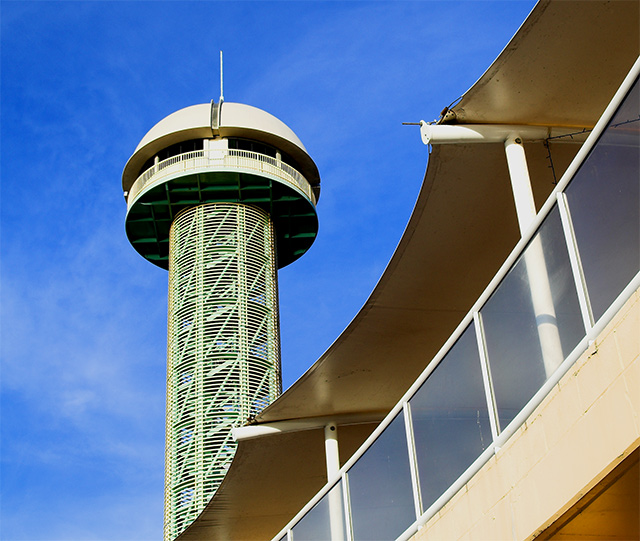
I very much enjoyed this photograph on first view. For me, the composition, interesting shapes, and rich colour in the sky have a high impact. The intersecting lines of the foreground and background structures offer a nice effect, as does the softer parabolic shapes that cut through the image diagonally. I think the "angle of attack" here was well thought out.
The compositional interest leads to closer inspection, and for me, the colours turn out to be a bit too saturated. This is especially apparent in the shadows beneath the circular structure, where added saturation has resulted in what appears to my eye as an unnatural green cast. The sky takes on a blueness that may be almost "too blue", if that were possible. I also see some of the saturated greens in the column.
There's a bit of softness around the far structure that may not be beneficial to an architectural photograph; it seems to me that close attention to depth of field is called for with such a subject. Finally, my personal taste is to avoid "corner cuts" as we see in the lower right, where the darker element cuts off a very triangular shape from the image. However, it is certainly true that this is part of an element that is an integral part of the overall composition, which I like very much, so it comes down to personal taste. I may have opted to clone out that portion of the image to make it less prominent.
Overall, this is a fine example of an archictural image well executed.
I hope this helps,
Louis |
|
 Photographer found comment helpful. Photographer found comment helpful. |
Comments Made During the Challenge  |
|
|
06/04/2006 07:33:53 PM |
Owen? Every time I see this thing it always reminds me of a great big .....
beer. |
|
| Photographer found comment helpful. |
|
|
06/04/2006 02:13:15 PM |
| Nice colours and saturation, but which one am I to focus on? The walkway with eves doesn't hold my attention enough, the tower/observatory is more interesting, but small distant and hidden. |
|
| Photographer found comment helpful. |
|
|
06/03/2006 09:07:39 AM |
| Go the knights!! I assume this is newcastle - otherwise ignore comment :) |
|
| Photographer found comment helpful. |
|
|
06/02/2006 12:42:43 AM |
Using a new formula....
Meets the Challenge = 2
Technical Merit = 1
Holds Interest = 1
Creativity = 1
The "wow factor" = 0
Final score: 5 |
|
| Photographer found comment helpful. |
|
|
05/31/2006 10:14:37 PM |
|
| Photographer found comment helpful. |
|
|
05/30/2006 08:08:21 PM |
| The architecture fits the challenge well....7 |
|
| Photographer found comment helpful. |
|
|
05/29/2006 08:44:29 AM |
| I like the composition and the juxtaposition of the two elements. Eye flow is nice as well. Top of tower seems a little bright for me, maybe a little more constrast in fg / maybe not.... Nicely done, good luck! |
|
| Photographer found comment helpful. |
Home -
Challenges -
Community -
League -
Photos -
Cameras -
Lenses -
Learn -
Help -
Terms of Use -
Privacy -
Top ^
DPChallenge, and website content and design, Copyright © 2001-2025 Challenging Technologies, LLC.
All digital photo copyrights belong to the photographers and may not be used without permission.
Current Server Time: 03/12/2025 08:07:57 PM EDT.