| Author | Thread |
|
|
08/22/2005 12:08:02 PM |
| Very cool effect. Good job. I love these types of images and you pulled it off nicely. |
|
|
|
11/15/2003 10:39:00 PM |
| cool-however i've seen this in countless puzzle books. 7-the only thing taking away is the faces stand out because on their cheeks (more obvious on right face) theres some shine in which you can see a freckle or something-some may find this as a way the photo is better, but htis is just my opinion. cool shot :) |
|
|
|
08/26/2003 02:59:53 PM |
| i liked it. I feel like its my fault its not totally black. I didn't like the totally black version. Maybe it was something inbetween we needed, or more contrast. I still like it, and I still think its one of the few shots that put the space at the forefront of the image. |
|
 Photographer found comment helpful. Photographer found comment helpful. |
|
|
08/25/2003 02:30:37 PM |
| Since you didn't like the way it looked as a "full silhouette," with completely blacked out faces, I think this would have done a lot better if you used lighting that gave you high-contrast shadows. Instead, I can see two faces that have dull, low-contrast details that detract from the effect you were going for. |
|
| Photographer found comment helpful. |
|
|
08/25/2003 01:32:20 AM |
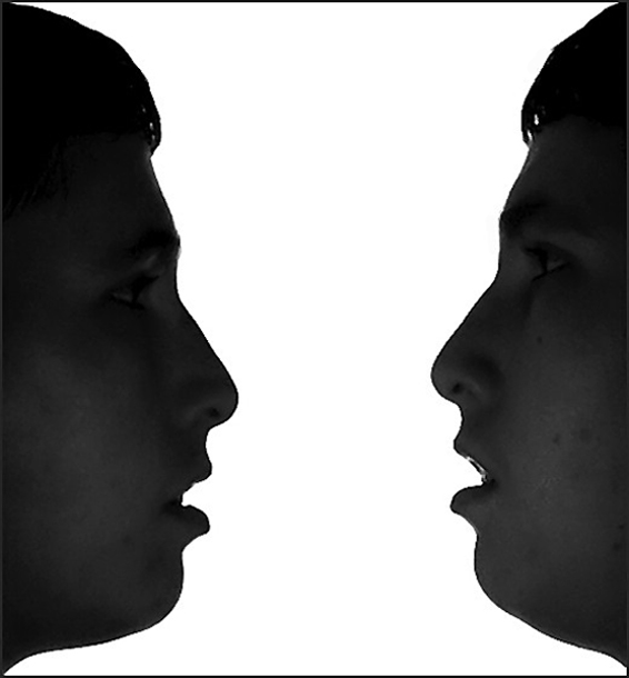
Jacko - I respect your photography as being technically 10x better than mine. But I think you don't/didn't understand neg space.
@everyone - I know it's not perfectly symmetrical. It's me. I tried. I didn't have a way to line it up, so I took a lot of shots and just kept trying. Obviously with a cuter model or something this would have done better.
Also - I had a full silhouette. It didn't look like a photograph, it looked like a drawing.
M |
|
|
|
08/25/2003 12:06:44 AM |
| Hey you got higher than your prodiction :-D I don't understand why so many ones though. I mean it meets the challenge and it looks cool :) |
|
| Photographer found comment helpful. |
Comments Made During the Challenge  |
|
|
08/24/2003 09:02:56 PM |
| This is good for a grin, besides being a decent photo. It might have been worth a few more tries, though - the one on the right is holding his head higher than the one on the left, so that the lines are wrong for the vase (and the noises/mouths/eyes are not directly across from each other). |
|
| Photographer found comment helpful. |
|
|
08/24/2003 01:36:24 AM |
| One of the better ideas of the challenge. The right head is very slightly tilted up, but that could probably be easily fixed up with some spot editing later. 9 |
|
| Photographer found comment helpful. |
|
|
08/22/2003 10:34:07 PM |
| it must have taken a LOT of work to get this one to work out correctly. good job. |
|
| Photographer found comment helpful. |
|
|
08/22/2003 01:30:58 PM |
|
| Photographer found comment helpful. |
|
|
08/20/2003 07:54:21 PM |
| Cool idea...could be a little better matched faces. Great shot. |
|
| Photographer found comment helpful. |
|
|
08/20/2003 05:17:52 PM |
| Nice try on a classic Illusion. I'd really like to see less detail in the faces, looked better in the thumbnail. Nice clean white background. Not sure how this fits into negative space. Jacko. 6 |
|
| Photographer found comment helpful. |
|
|
08/20/2003 04:44:34 PM |
| Mavrik? good take on the CLASSIC use of negative space... I would have tried to have the faces as black as possible though... I think being able to see the details kind of destroys the idea. Also the two heads aren't quite level... good use of your camera though for two pictures in one frame ;-) |
|
| Photographer found comment helpful. |
|
|
08/20/2003 10:30:44 AM |
| Excellent use of negative space, probably close to the best in this challenge. Reminds me of pictures I have seen of optical illusions along similar lines. Good work. One of my favorites this week, infact I had originally given you an 8 but after looking through the rest of the pics I'm upping this to a ten if for no other reason than you have conveyed negative space better than any other pic in this challenge. Good Luck, Todd. 10 |
|
| Photographer found comment helpful. |
|
|
08/20/2003 12:06:15 AM |
| iv'e seen this before very clever |
|
| Photographer found comment helpful. |
|
|
08/19/2003 10:32:43 PM |
| I remember this optical illusion! This is a fun revisit of it, and the negative space really enhances the feel of the photo. The darkness on the face is nice, and I like that I can still see some detail if I look. I can't help but think that the white background could be some cool color, though. This must have been one tricky shot! Very nice. 9 |
|
| Photographer found comment helpful. |
|
|
08/19/2003 10:50:40 AM |
| Although interesting, in my opinion, for this to work as you intend, both sides must be perfectly symmetrical. You are a little off (the right silhouette is a little higher than the left and you can see just a hint of light on the lips on that face as well) so you are losing some of what you are going for. Not terribly, but enough to deter from the illusion. I have no doubt though that it was difficult enough to get it this close. I applaud the attempt. |
|
| Photographer found comment helpful. |
|
|
08/18/2003 10:10:20 PM |
| Excellent use of negative space. |
|
| Photographer found comment helpful. |
|
|
08/18/2003 03:18:46 PM |
|
|
|
08/18/2003 01:46:26 PM |
| I'd like to have seen the faces as total silhouette. Image is a bit pixellated with quite a few jaggies. Good, creative take on the challenge. |
|
| Photographer found comment helpful. |
|
|
08/18/2003 01:32:01 PM |
| this would have been better if I couldn't see the detail in the faces. maybe add more contrast. good luck |
|
| Photographer found comment helpful. |
|
|
08/18/2003 10:09:33 AM |
|
| Photographer found comment helpful. |
|
|
08/18/2003 06:03:23 AM |
| How many times did you have to run back and forth between the left and right sides of the frame? The vase isn't perfectly symmetrical, but would still hold water. 6 |
|
| Photographer found comment helpful. |
|
|
08/18/2003 03:36:40 AM |
| Go on, go and kiss ya self then! I gotta say this face looks familiar, that you Mav? Original mate - 9. |
|
| Photographer found comment helpful. |
|
|
08/18/2003 01:23:41 AM |
|
| Photographer found comment helpful. |
|
|
08/18/2003 01:20:19 AM |
| i think it might have been a little better if it was a complete silouhette. |
|
| Photographer found comment helpful. |
|
|
08/18/2003 12:20:40 AM |
| Contast is very cool. Sharpness is also very good. At first I thought the image was dark, however it really does add to the illusion. Its funny, as I type this now, I can only see the image in the corner of my eye and I see the vase not the model as when you are not looking directly the dark areas look 100% black. |
|
| Photographer found comment helpful. |
Home -
Challenges -
Community -
League -
Photos -
Cameras -
Lenses -
Learn -
Help -
Terms of Use -
Privacy -
Top ^
DPChallenge, and website content and design, Copyright © 2001-2025 Challenging Technologies, LLC.
All digital photo copyrights belong to the photographers and may not be used without permission.
Current Server Time: 04/27/2025 05:21:19 AM EDT.