| Author | Thread |
Comments Made During the Challenge  |
|
|
06/06/2006 01:24:07 AM |
| Very simple and clean. I like it. |
|
|
|
06/04/2006 02:45:32 AM |
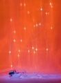
| I like your minimalist approach to this shot. It has a good interest factor. Colors look pretty good. Although sometimes breaking the 'rule' and centering a horizon can work, I just don't think it is helping this image being centered. I think if you had placed the horizon either closer to the top or bottom, it could strengthen the presentation here, and play even stronger to the mimimalist theme of the shot. |
|
|
|
06/02/2006 03:35:30 AM |
| I like it. I think it would look better if you saturated the colors a bit more. |
|
|
|
06/01/2006 12:32:50 AM |
|
|
|
05/31/2006 03:33:13 PM |
|
|
|
05/31/2006 12:09:25 PM |
| I'd like to see more of the people |
|
|
|
05/31/2006 07:19:39 AM |
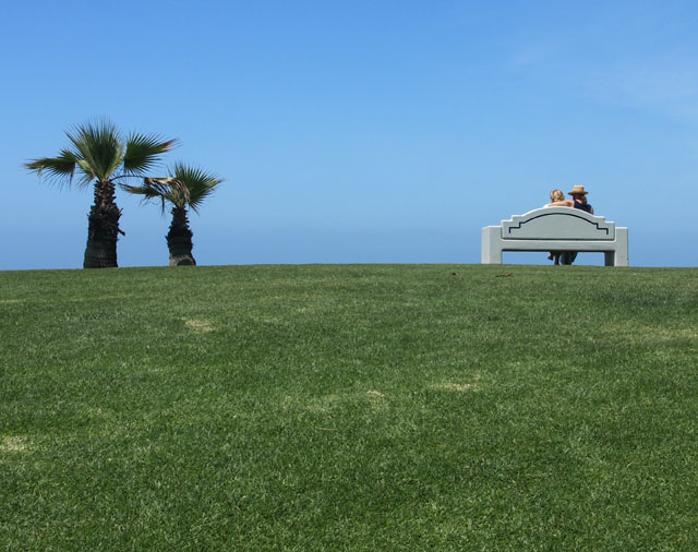
| Great, love the parallelism. |
|
|
|
05/31/2006 07:04:08 AM |
| Clever how the tree on the left looks like it has its "arm" over the little tree's shoulder. |
|
|
|
05/31/2006 02:20:46 AM |
| Lovely contrast between the blue and the green. Great framing - keeping the subject simple. |
|
|
|
05/31/2006 12:19:43 AM |
| this is one of my most fav songs |
|
Home -
Challenges -
Community -
League -
Photos -
Cameras -
Lenses -
Learn -
Help -
Terms of Use -
Privacy -
Top ^
DPChallenge, and website content and design, Copyright © 2001-2025 Challenging Technologies, LLC.
All digital photo copyrights belong to the photographers and may not be used without permission.
Current Server Time: 03/12/2025 03:20:50 PM EDT.