| Author | Thread |
|
|
06/09/2006 05:42:41 PM |
Critique Club Comment :)
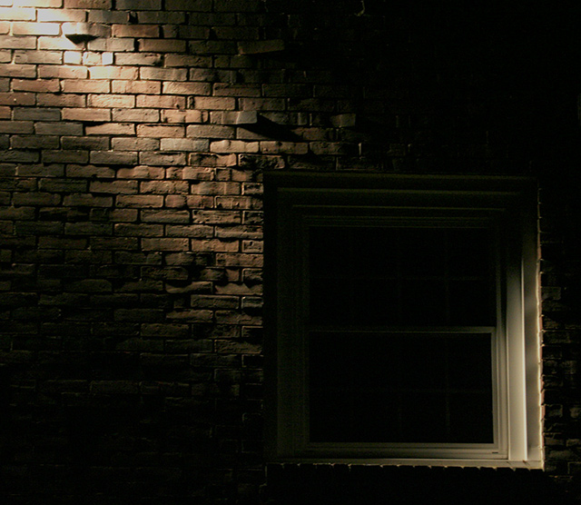
First impression: Neat subject, nice dramatic effect, conveys some emotion and seems to give me that overall feeling of something mysterious, not to mention it definitely meets the challenge.
Focus and clarity: The focus seems to be pretty good, though I would like to see the bricks in the upper left hand corner a little sharper. I like that your window is not in as much focus, because the window is not the main subject of this photo
Angle, framing & composition: I think that the composition is very nice; I don't have a ruler on me, but looks like good use of the rule of thirds. Seems to me that you based the balancing of the photo on the window by compromising between the bottom line and the right side line of the window. I took your photo and tilted it counterclockwise just a smidge so that the bottom of the window was parallel to the horizontal axis. This also aligned the left side of the window with the vertical axis but tilted the right side of the window just a bit, but the picture seems more balanced to me this way. I might suggest leaving a tad more space between the window and the bottom right hand corner.
Lighting: I think that you did an excellent job with the lighting, like you said, not too much and not too little. You can see some detail in most all of the photo, while maintaining the dramatic single lighting effect you were going for. I noticed that someone mentioned they would like to see more detail on the window frame, and I see what they are saying. The lighting in the bottom right of the window is a bit harsh compared to the top left. This would be a hard feat to accomplish given that you can only have one light and the angle of the light is already on the breaking edge of almost having a blown spot where it first hits on the bricks. You might try playing around with angles, but I think that you have already done a great job.
Post processing: I don't see anything that jumps out at me as evidence of post processing errors. My suggestion would be to bump up your colors. Also, since this is advanced editing, you could try selective sharpening to bring out the bricks while leaving the window how it is. (and while you're at, maybe selectively lighten the top left diagonal of the window)
Overall, my opinion: I think that you did a great job on this photo, and you've got the score to prove it. Getting a good in-camera photo to play with in the first place is always a one-up, now with a little post processing, this photo could really stand out.
If you have any questions/comments regarding this critique, or would like further clarification, feel free to PM me.
Amanda |
|
 Photographer found comment helpful. Photographer found comment helpful. |
|
|
06/08/2006 11:57:57 AM |
Originally posted by American_Horse:
It's your personal best.
Now ramp it up a bit, and do better.
How about voting on some submissions as well. It's the very least you could do. |
Thanks for the message - You're absolutely right - I should vote more - I'm impressed that you have given more votes than you've received. I figured I'd take the first 2 weeks to learn about the site, its features and how everyone votes and then start voting. I guess that time is now. Thanks for the reminder. |
|
|
|
06/07/2006 09:08:52 AM |
It's your personal best.
Now ramp it up a bit, and do better.
How about voting on some submissions as well. It's the very least you could do. |
|
| Photographer found comment helpful. |
Comments Made During the Challenge  |
|
|
06/06/2006 04:13:42 PM |
| love this photograph...especially seeing the details of the bricks. good job! |
|
| Photographer found comment helpful. |
|
|
06/06/2006 05:06:56 AM |
|
| Photographer found comment helpful. |
|
|
06/04/2006 12:00:50 AM |
I don't know why I like this, maybe because of it's simplicity.
I like the offset of the comp, the lighting works for me, the top of the bricks are a bit blown, and the window is dipping into the abyss, great texture, excellent movement, color a bit flat but it works, minimalistic, nice lines |
|
| Photographer found comment helpful. |
|
|
06/02/2006 04:49:27 PM |
|
| Photographer found comment helpful. |
|
|
06/02/2006 01:20:05 AM |
Image quality is an issue, but it's a cool concept.
Extra points for such a unique subject! |
|
| Photographer found comment helpful. |
|
|
05/31/2006 07:52:35 PM |
| Makes you wonder what's inside... |
|
| Photographer found comment helpful. |
|
|
05/31/2006 03:44:21 PM |
|
| Photographer found comment helpful. |
|
|
05/31/2006 04:30:08 AM |
| I like the shadows brought out by the angle of the light. Would like to see a bit more detail though on the window frame |
|
| Photographer found comment helpful. |
|
|
05/31/2006 04:17:03 AM |
| I dont know if this really reflectes "the darkness within" but still an appealing photo. Hope this does well for you.7. |
|
| Photographer found comment helpful. |
Home -
Challenges -
Community -
League -
Photos -
Cameras -
Lenses -
Learn -
Help -
Terms of Use -
Privacy -
Top ^
DPChallenge, and website content and design, Copyright © 2001-2025 Challenging Technologies, LLC.
All digital photo copyrights belong to the photographers and may not be used without permission.
Current Server Time: 03/12/2025 03:00:07 PM EDT.