| Author | Thread |
|
|
06/27/2006 10:37:21 PM |
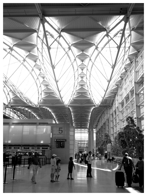
| Interesting perspective and great height. The bottom portion of the image does appear to be a little too dark (maybe more contrast to brighten the whites?), but very cool composition. |
|
 Photographer found comment helpful. Photographer found comment helpful. |
|
|
06/08/2006 04:06:57 AM |
| The main roof/light shapes that you wanted to highlight are balanced. But other lines don't seem straight, and with a picture where lines are so important, it bothers me some. A tighter crop at the top would have eliminated the angled lines there. I am not sure what at all you could have done about the 5 structure. And it is needed to show context; if you'd cropped it out, just showing the roof/lights, it might have been really confusing. Maybe this is where you need a certain lens to correct distortion? (I have really NO experience or knowledge here at all.) And I think I read there's something you can do about that in post processing but that it was illegal (if I remember correctly). So, in using what you had, I would say that this shot is a success. It gives me an impressive sense of scale and wonder - as a cathedral is to religious observers, this place is to travelers. You captured that very well, partly by having people in the shot to convey the height of the roof. I also love the lighting - there is good contrast, and I find the patterns of light on the floor interesting. |
|
| Photographer found comment helpful. |
|
|
06/01/2006 06:05:32 PM |
This looks good for the most part, however I would suggest some selective levels/curves in the bottom half to brighten things up a bit. As it is right now, it's a bit too dark for my taste, with few whites.
I like the receding lines in the ceiling. Nice capture. |
|
| Photographer found comment helpful. |
Home -
Challenges -
Community -
League -
Photos -
Cameras -
Lenses -
Learn -
Help -
Terms of Use -
Privacy -
Top ^
DPChallenge, and website content and design, Copyright © 2001-2025 Challenging Technologies, LLC.
All digital photo copyrights belong to the photographers and may not be used without permission.
Current Server Time: 04/06/2025 07:53:38 PM EDT.