| Author | Thread |
|
|
06/13/2006 03:15:50 PM |
Hey there from the Critique Club
This capture is definitely better than the original entry, but it is still far too small. Try [url=//www.dpchallenge.com/tutorial.php?TUTORIAL_ID=26 ]THIS LINK[/url]. I think that it will help you pull much higher scores on future challenges. I can see that there is a tremendous amount of detail in this capture, but I cannot see where the main focus is located, I cannot determine how deep the depth of field is, nor can I get a good enough feel for the lighting to give an adequate critique. Always, always, always take advantage of the full dimension parameters that DPC allows. Read through that tutorial. I believe you will be happily surprised with your next entry.
Eric
|
|
Comments Made During the Challenge  |
|
|
06/12/2006 11:19:37 PM |
| This is unfortunately way to small. |
|
|
|
06/10/2006 11:59:43 PM |
| I would like to see this bigger as the details have me intrigued. I think if you tried this at a different angle...eliminating the entire background and maybe closer than this would do really well. But still a 7 from me. |
|
|
|
06/08/2006 08:55:35 AM |
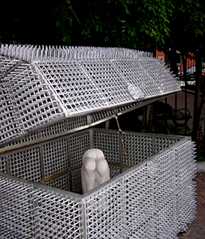
I prefer larger photos. You only use 300x350 while you could use 548x640.
This makes it hard to see details. I don't see what is in this box. |
|
 Photographer found comment helpful. Photographer found comment helpful. |
|
|
06/06/2006 07:09:55 AM |
| I almost don't know what to say. It's just so uninteresting and well looks like a snapshot of nothing. |
|
| Photographer found comment helpful. |
Home -
Challenges -
Community -
League -
Photos -
Cameras -
Lenses -
Learn -
Help -
Terms of Use -
Privacy -
Top ^
DPChallenge, and website content and design, Copyright © 2001-2025 Challenging Technologies, LLC.
All digital photo copyrights belong to the photographers and may not be used without permission.
Current Server Time: 03/11/2025 01:13:56 PM EDT.