| Author | Thread |
|
|
06/12/2006 07:03:46 AM |
| this was my fav in this challenge...really wonderful concept and processing... |
|
 Photographer found comment helpful. Photographer found comment helpful. |
Comments Made During the Challenge  |
|
|
06/11/2006 10:53:08 PM |
| I like the composition and color. Intriguing. |
|
| Photographer found comment helpful. |
|
|
06/11/2006 10:03:15 PM |
| New to voting, no special comment here ... |
|
| Photographer found comment helpful. |
|
|
06/11/2006 08:30:43 AM |
| a most interesting and effective shot..well done.. |
|
| Photographer found comment helpful. |
|
|
06/11/2006 01:17:54 AM |
| Nice colors, trendy use of exposure. |
|
| Photographer found comment helpful. |
|
|
06/10/2006 02:38:29 PM |
| Interesting choice for the challenge - works for me, anyway. |
|
| Photographer found comment helpful. |
|
|
06/09/2006 07:31:10 AM |
| Very grungy image. I like it. |
|
| Photographer found comment helpful. |
|
|
06/06/2006 02:15:41 PM |
| Good use of contrast & colors. |
|
| Photographer found comment helpful. |
|
|
06/06/2006 05:58:13 AM |
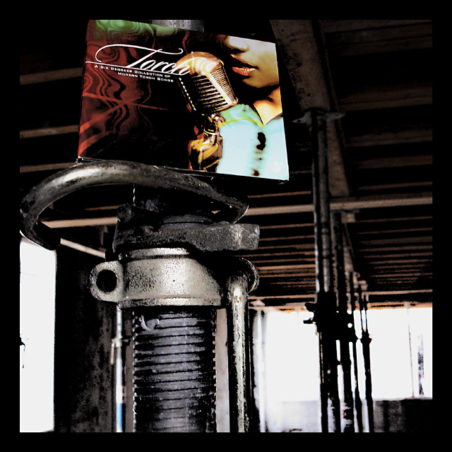
| hi, i do not recognize this ... empty room ? where ? |
|
|
|
06/05/2006 07:03:27 PM |
|
| Photographer found comment helpful. |
|
|
06/05/2006 05:05:41 PM |
| Interesting, very artsy. I wish the metal object were also in focus. |
|
| Photographer found comment helpful. |
|
|
06/05/2006 01:59:25 PM |
| Interesting photo but not really an empty room |
|
| Photographer found comment helpful. |
|
|
06/05/2006 09:44:53 AM |
| not sure I understand the concept. The room isn't really empty |
|
| Photographer found comment helpful. |
|
|
06/05/2006 03:42:16 AM |
| this is just very weird - the record sleeve is completely out of context with its surroundings. even more weirder is that it seems to work exceedingly well - this itself would make a glorious album cover. with regards to meeting the challenge, i could be a bit pernickity and mention that temporary props aren't actually part of the room... but that's just me being excessively stupid. i think the post-processing is fantastic and the slightly bonkers thinking behind it is to be saluted. the only real slight complaint is that i would have liked to see the sleeve a little less stuck at the top of the shot. overall - 9. |
|
| Photographer found comment helpful. |
|
|
06/05/2006 02:12:51 AM |
| seems to me this image is split in two the lighter lower haly takes my eye out 5 |
|
| Photographer found comment helpful. |
|
|
06/05/2006 01:17:25 AM |
| love the contrast and the rich colours here |
|
| Photographer found comment helpful. |
Home -
Challenges -
Community -
League -
Photos -
Cameras -
Lenses -
Learn -
Help -
Terms of Use -
Privacy -
Top ^
DPChallenge, and website content and design, Copyright © 2001-2025 Challenging Technologies, LLC.
All digital photo copyrights belong to the photographers and may not be used without permission.
Current Server Time: 03/12/2025 07:41:28 AM EDT.