| Author | Thread |
|
|
07/19/2006 10:50:49 PM |
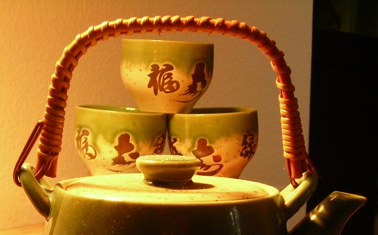
I think you had a good idea here�few things jump out at me that could help you improve upon this image. First keep the background the same�I kinda like the all black look�like on the right hand side. Also looks as if the lighting might be a bit harsh�as you can see on the front edge of the pot�bright white standing out�those are your highlights getting blown, but that is easily fixed. Just shoot a bit faster of a shutter speed. With just those two things I think you will see a different shot�but still in line with your idea for the shot�Oh and Welcome to the site�great place to learn even for people who just want to have fun.
Clint
|
|
 Photographer found comment helpful. Photographer found comment helpful. |
Comments Made During the Challenge  |
|
|
06/19/2006 11:38:29 PM |
|
| Photographer found comment helpful. |
|
|
06/19/2006 08:35:07 AM |
| Interesting composition! Your white balance looks off, though... |
|
| Photographer found comment helpful. |
|
|
06/16/2006 07:20:14 PM |
| would have been much nicer if the background was all white. |
|
| Photographer found comment helpful. |
|
|
06/16/2006 07:07:33 PM |
| the background and lighting is kind of distracting |
|
| Photographer found comment helpful. |
|
|
06/14/2006 04:50:52 PM |
| Neat idea. The lighting is harsh, however, and the white-to-black transition on the right side is distracting. |
|
| Photographer found comment helpful. |
|
|
06/14/2006 09:41:34 AM |
|
| Photographer found comment helpful. |
Home -
Challenges -
Community -
League -
Photos -
Cameras -
Lenses -
Learn -
Help -
Terms of Use -
Privacy -
Top ^
DPChallenge, and website content and design, Copyright © 2001-2025 Challenging Technologies, LLC.
All digital photo copyrights belong to the photographers and may not be used without permission.
Current Server Time: 04/02/2025 06:23:28 PM EDT.