| Author | Thread |
|
|
07/29/2006 09:13:56 PM |
HI Kelly, I see how much of an improvement you've made to this from the original. Well done! It's a marked improvement over the original, for sure.
I completely get the idea of using games for the challenge (one of my favorite indulgences as well!), so it fits the challenge well, imo.
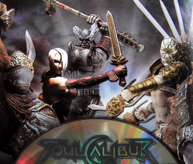
A couple of thoughts for you... the lighting on the CD doesn't seem to fit well with the background. Either add more light as it sits or tilt the cd back towards the background and light it so it blends better.
The CD is also noisy and I can't tell if despeckle did what you wanted it to do. I believe Noise Ninja or Neat Image are free programs (or have a free version) and I've heard both work well for reducing noise. (I use NI.)
Unfortunately, there are a bunch of people here who voted 1 and 2, neither of which I agree with because it's a better photo than that. 1's and 2's should only be given out to images that are horrible, of which, again, this is not.
Another thing I'd like to mention is your title. I love good titles. In this case, the title doesn't convey much emotion which could have helped sway some of the voters to a point or two higher than they voted. I'm thinking of something like, "I Sold My Soul..." or "My Passion, My Soul..."
That's about all I can think of. Thanks for reading it all and if you want to discuss anything, feel free to pm me.
George |
|
 Photographer found comment helpful. Photographer found comment helpful. |
|
|
06/23/2006 01:52:26 PM |
| I happen to like this alot...for 1 i can relate to this but i have had alot of game systems i like World of Warcraft ALOT....it like a drug lol. ok yto your picture i like this alot the one befor you edit looked flat and like a poster. i likethis one because after you were done editing it looks like you have the actuall figures in there i would have gave you an 8. only due to the flash mark up in the top right and the girl in the middle her white is a little bright. but i say well done |
|
| Photographer found comment helpful. |
|
|
06/21/2006 03:42:33 PM |
Yeah I see your point in this image. Unfortunately not too many saw the same thing here. It's tough when the scores are purely based on imagery without knowing enough background about the image itself. Now that I read it, I can relate.
As far as improving the image, a better DOF could be used to achieve full sharpness across the board. This is where I think this image suffered. |
|
| Photographer found comment helpful. |
Comments Made During the Challenge  |
|
|
06/17/2006 11:32:20 PM |
|
| Photographer found comment helpful. |
|
|
06/17/2006 07:46:15 AM |
| while the image is interesting I think it is someone else's artwork that makes it that way. |
|
| Photographer found comment helpful. |
|
|
06/15/2006 07:11:56 PM |
| Simple (perhaps overly so because this is more a photo of a photo ) - good rainbow colors on the CD - a bit subtle though - almost missed it. Its a little annoying that some objects are cropped off on all but one side - the horn on the left (with something above it, the battle axe on top and the S and R on the bottom) - 4 |
|
| Photographer found comment helpful. |
|
|
06/15/2006 05:23:27 PM |
| I dont see any indulgence |
|
| Photographer found comment helpful. |
|
|
06/15/2006 05:16:59 PM |
|
| Photographer found comment helpful. |
|
|
06/14/2006 07:53:30 AM |
| Sorry, but this one doesn't work much for me, it seems to only just escape being a literal representation of someone else's artwork. You've thought about composition and combining the picture element with the CD - but as a photo, it looks too flat to carry much impact. |
|
| Photographer found comment helpful. |
|
|
06/14/2006 06:46:41 AM |
| I bet this gets a DQ for being a literal representation of existing art. But even if not, picture is slightly dull even though technically OK. |
|
| Photographer found comment helpful. |
|
|
06/14/2006 01:24:39 AM |
| nice composition is that cover art or miniatures? |
|
| Photographer found comment helpful. |
|
|
06/14/2006 12:39:14 AM |
|
| Photographer found comment helpful. |
Home -
Challenges -
Community -
League -
Photos -
Cameras -
Lenses -
Learn -
Help -
Terms of Use -
Privacy -
Top ^
DPChallenge, and website content and design, Copyright © 2001-2025 Challenging Technologies, LLC.
All digital photo copyrights belong to the photographers and may not be used without permission.
Current Server Time: 03/12/2025 10:18:23 AM EDT.