| Author | Thread |
|
|
06/26/2006 02:31:45 PM |
| I love this. Sorry it didn't do better for you. I had given it an 8. |
|
|
|
06/26/2006 01:49:35 PM |
---Greetings from the Critique Club!---
I think I critiqued your Shadows III entry! Lucky you!
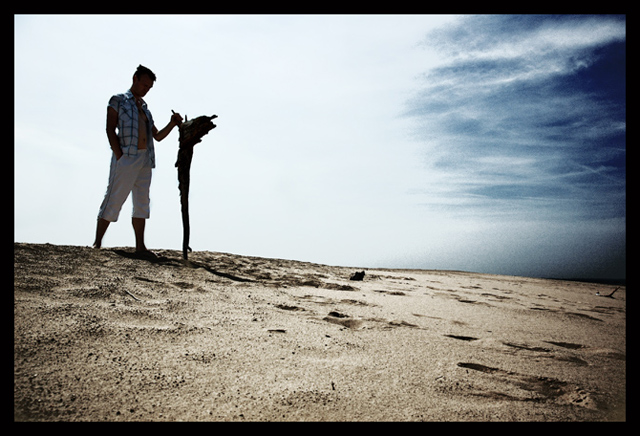
First impression - Keeping his pants on was the right decision!
The landscape looks desolate, but the subject detracts from the desolation. He looks too fresh and calm IMO.
Also, I can not make out what he is holding or why he is holding it. I want to know more about what is going on in the image.
The white behind the subject is perhaps a bit too hot, although I kinda like it. I wish the blue extended more tot he left side of the image.
A good shot that lacks that elusive "Wow" factor that a lot of the voters look for.
I hope this was helpful. Let me know if you have any questions.
David
|
|
 Photographer found comment helpful. Photographer found comment helpful. |
Comments Made During the Challenge  |
|
|
06/25/2006 10:41:44 AM |
| not entirely sure how this is desolation ... but a very nice picture |
|
|
|
06/23/2006 06:19:51 PM |
| Good work...the bright background highlights the subject well. |
|
| Photographer found comment helpful. |
|
|
06/23/2006 01:25:51 PM |
| would like this more if the person and object werent so dark. I cant tell what the heck that thing is the person is touching. nice color though. |
|
| Photographer found comment helpful. |
|
|
06/23/2006 05:06:22 AM |
| Nice, simple, clean...wonderful post processing:)) Sky is a little burnt out, but I don't care;) |
|
| Photographer found comment helpful. |
|
|
06/23/2006 03:48:55 AM |
| Lovely toning and composition. |
|
| Photographer found comment helpful. |
|
|
06/20/2006 10:39:05 PM |
| Nice tones and comp. I like how the sky gradients from blue to white. It really enhances the subject. |
|
| Photographer found comment helpful. |
|
|
06/20/2006 08:48:24 PM |
| This is a really nice image with sureal tones that draw you towards the subject. If I could see the subject's face a bit better I would like that, imo. |
|
| Photographer found comment helpful. |
|
|
06/20/2006 08:21:03 PM |
| Another one that I underrated at first. 5 to 7 |
|
| Photographer found comment helpful. |
|
|
06/20/2006 12:52:56 AM |
| really like your post processing you did on this I will have to come back and see how you did, I like how you have the backlighting and details in the model and still in the right side of the sky |
|
| Photographer found comment helpful. |
|
|
06/19/2006 08:41:35 PM |
| Great idea - good composition. For me, I'd like the guy to be either in silhouette, or a bit brighter - as it is, he's just falling between the two. Great image though! |
|
| Photographer found comment helpful. |
|
|
06/19/2006 04:54:47 PM |
| The featureless horizon is the language of desolation in this photo. The silhouette enhances the feeling. |
|
| Photographer found comment helpful. |
|
|
06/19/2006 12:50:21 PM |
| Wow - love the colors (could have been more around the guy, but...)Great, and the frame suits it well. |
|
| Photographer found comment helpful. |
Home -
Challenges -
Community -
League -
Photos -
Cameras -
Lenses -
Learn -
Help -
Terms of Use -
Privacy -
Top ^
DPChallenge, and website content and design, Copyright © 2001-2025 Challenging Technologies, LLC.
All digital photo copyrights belong to the photographers and may not be used without permission.
Current Server Time: 03/11/2025 02:10:25 PM EDT.