| Author | Thread |
Comments Made During the Challenge  |
|
|
09/02/2003 06:18:29 PM |
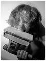
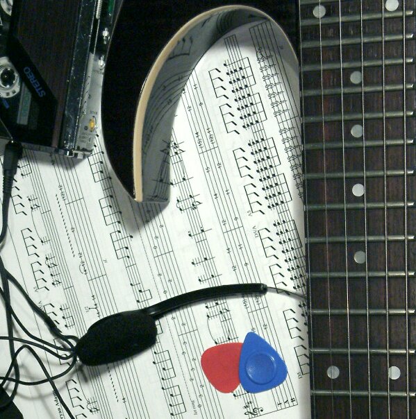
| I think the composition would also have worked without the walkman and just letting the sheet music be the negative space. |
|
|
|
08/30/2003 06:19:52 PM |
| Great idea, but the lighting is not quite working. |
|
 Photographer found comment helpful. Photographer found comment helpful. |
|
|
08/28/2003 10:42:36 AM |
| Kind of busy, too many subjects for my eye to meet. |
|
|
|
08/28/2003 07:56:34 AM |
| Nice idea, but the composition really doesn't do it for me. A few tips: I think the guitar neck should point up at an angle. There should be less manuscript, and the direction of the lines should be an integral part of the composition. Experiment with more dramatic lighting, this picture doesn't set a mood to me. For example, for heavy metal I'd experiment with red lighting that would throw a lot of shadows. 6 |
|
| Photographer found comment helpful. |
|
|
08/27/2003 08:10:07 PM |
| This is great. Love your curves and straight lines mixture. |
|
|
|
08/27/2003 05:40:56 PM |
| my immediate reaction is that this would benefit from a 90 degree turn to the right...just me |
|
|
|
08/27/2003 11:20:54 AM |
| This is a wonderful photograph, I'm just not sure it fits "my" idea of tools. Wonderful composition here and the red/blue pics add just the perfect touch for color. |
|
| Photographer found comment helpful. |
|
|
08/27/2003 08:55:07 AM |
| Very original, I like the natural framing. I also like the idea of the two guitar pics in red and blue to break the dominant black and white tones. |
|
Home -
Challenges -
Community -
League -
Photos -
Cameras -
Lenses -
Learn -
Help -
Terms of Use -
Privacy -
Top ^
DPChallenge, and website content and design, Copyright © 2001-2025 Challenging Technologies, LLC.
All digital photo copyrights belong to the photographers and may not be used without permission.
Current Server Time: 03/13/2025 02:03:21 AM EDT.