| Author | Thread |
|
|
07/03/2006 10:34:57 PM |
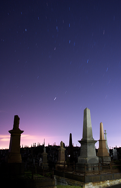
Greetings from the Critique Club!
Hi, Patrick. Welcome to DPC. I notice this is your first challenge and what a nice way to start! I'm reading your comments and I must say I don't believe you. :) If you really held the shutter down like that maybe you don't need a remote? :P Seriously, that's pretty impressive.
As for the photo itself, I like the composition and the control of light. No blown out highlights to be found anywhere. The star trails are also good. I wish there were more of them but nothing you can do about that. The image also has good color. I like the choice of the locale which provides lots of interest making this not just a "sky pic" like so many of these shots tend to be.
If this was advance editing I would suggestion bringing out a bit more detail in the cemetery using curves or shadow/highlights adjustments. Other than that I don't think there is much more you can do to improve this specific shot. Good luck and I look forward to seeing more of your work. |
|
Comments Made During the Challenge  |
|
|
06/26/2006 11:47:07 PM |
| I like the picture, I like the setup, but the lighting just doesn't seem even. Kind of wierd looking. |
|
 Photographer found comment helpful. Photographer found comment helpful. |
|
|
06/26/2006 09:56:05 PM |
| excellent...hope this does well for you |
|
| Photographer found comment helpful. |
|
|
06/26/2006 12:36:17 PM |
| very crisp, clean image. good composition and nice star trails. 7. |
|
| Photographer found comment helpful. |
|
|
06/25/2006 01:25:55 PM |
| Nice choice of foreground not the usual star trails. |
|
| Photographer found comment helpful. |
|
|
06/25/2006 11:45:08 AM |
| Eerie. I'd like to see the left monument straighted. I'm not sure if that would have been allowed under basic editing though. |
|
| Photographer found comment helpful. |
|
|
06/23/2006 08:46:27 AM |
| I really like the different lighting on the headstones, gives an interesting dynamic to the composition |
|
| Photographer found comment helpful. |
|
|
06/22/2006 10:21:24 PM |
| Very interesting subject and strongly composed. Most would of gone with a gothic looking photo with this subject, I kind of like how you kept this with more naturally processed. It seems just right, great work! |
|
| Photographer found comment helpful. |
|
|
06/22/2006 08:10:42 PM |
|
| Photographer found comment helpful. |
|
|
06/22/2006 01:24:55 PM |
Meets Challenge:2
Aesthetics:2
Technical: 1
Wow: 0
Originality:1
Total Score: 6 |
|
| Photographer found comment helpful. |
|
|
06/21/2006 11:59:37 PM |
| Check spelling of cemetery |
|
| Photographer found comment helpful. |
|
|
06/21/2006 01:41:44 AM |
| nice photo, however the bottom left is a tad too dark, pulls away from the image. Curves would help bring this out more. |
|
| Photographer found comment helpful. |
Home -
Challenges -
Community -
League -
Photos -
Cameras -
Lenses -
Learn -
Help -
Terms of Use -
Privacy -
Top ^
DPChallenge, and website content and design, Copyright © 2001-2025 Challenging Technologies, LLC.
All digital photo copyrights belong to the photographers and may not be used without permission.
Current Server Time: 03/12/2025 02:34:36 PM EDT.