| Author | Thread |
Comments Made During the Challenge  |
|
|
09/02/2003 04:31:44 PM |
| Too much negative space and the toning doesn't work for me. |
|
 Photographer found comment helpful. Photographer found comment helpful. |
|
|
09/01/2003 03:56:13 PM |
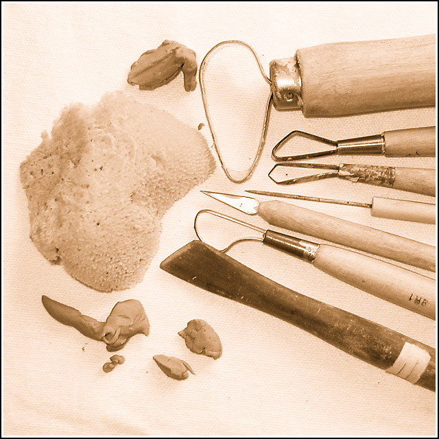
| I think sepia is a bit inappropriate as I find myself wanting to know what colour all the objects are! Interesting tools but I wonder if a more intriguing viewpoint would help to make the shot more interesting. |
|
| Photographer found comment helpful. |
|
|
08/29/2003 05:01:25 PM |
|
| Photographer found comment helpful. |
|
|
08/27/2003 12:29:15 PM |
| Nice selection of tools but far to light for me and I have my brightness down and my contrast up |
|
| Photographer found comment helpful. |
|
|
08/27/2003 11:18:26 AM |
| Sepia is a great choice for these tools. The focus seems a bit off though on a shot I otherwise like a lot. |
|
| Photographer found comment helpful. |
|
|
08/27/2003 10:19:18 AM |
| I like the sepia tone and the different textures present. The wrinkle at the bottom left is a little distracting but overall this is one of my favorites so far. |
|
| Photographer found comment helpful. |
Home -
Challenges -
Community -
League -
Photos -
Cameras -
Lenses -
Learn -
Help -
Terms of Use -
Privacy -
Top ^
DPChallenge, and website content and design, Copyright © 2001-2025 Challenging Technologies, LLC.
All digital photo copyrights belong to the photographers and may not be used without permission.
Current Server Time: 03/13/2025 04:49:31 AM EDT.