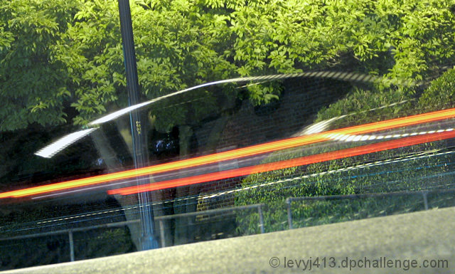
While shooting light streaks on a neighborhood street, this guy got in his sedan right across the street. The 2 second exposure started just after he began moving, so I captured a little of the shape and dashboard dials before only the tail light streak was visible.
Really wish this had been on a hill; the angle on the pole gives away that it's flat and I titled the camera when I took the shot to give the car a sense of speed. Reminds me of an ad I once saw that exhorted people to ski in Terre Haute, IN. It showed a skier on a steep slope except there was a silo in the background sticking out at a 45-degree angle. Quite funny.
Editing: cropped and lightened overall, cloned out a few of the light streaks to focus attention on the major ones, burned the two red streaks back to their original color, cloned the bushes to fill in some gaps, cloned out a white stripe in the upper right part of the pavement, changed the dials from green to blue so they'd stand out from the bushes, and sharpened the lettering on the pole. Ended up burning the shadows after lightening the whole pic because it emphasized noise too much. Probably overprocessed it. :)
This was the first time I used the clone and burn tools - now I'm getting how people use them so well in challenge winners I've seen!
Statistics
Place: 142 out of 177 Avg (all users): 4.8324 Avg (commenters): 5.6667 Avg (participants): 4.6429 Avg (non-participants): 4.9478 Views since voting: 870 Views during voting: 308 Votes: 185 Comments: 6 Favorites: 0
Camera Work/Technical: I think that your focus emphasizes your background a bit too much. If you could have caught the blur on a more shallow depth of field, I believe that your score would have benefited.
Lighting: Your lighting came out terrific. It is the main strength of this image.
Composition/Content: While the pole does give away the fact that the image was shot at a tilt, I do not believe that it detracts from the capture at all. It adds some interest to the photo, and actually helps move the viewer around the frame.
My Opinion: I really like it, but I think that it relied too heavily on the title. Keep in mind that these challenges have 200, 300, even 400 entries, and the voters spend very little time trying to figure out what is in the frame. I think that this image is far better than a 4.8, but it just took too long to figure out what was there. Nice work, and I look forward to more.
Ahhh...took me a minute. The title is what did it for me. Wonder what this would look like if you did a desat on all but yellow and red? This has an abstract feel to it. Certainly is 'Motion Blur'! ;^) Good luck in the challenge.