| Author | Thread |
|
|
07/09/2006 05:30:11 AM |
Greetings from the Critique Club:
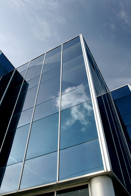
I like this picture. Although the the subject is not very interesting, I like the different tones of blue. That said, there are some things to improve upon. The crop shows slightly too much sky, and the column at the bottom annoys me a bit. I would either crop it closer, or show a bit more of it. On the other hand, ending the diagonals to the corners of the picture also gives some impact, so maybe crop a tighter to the left and right too.
I do like the reflection of the cloud, but not the reflection of the wire(?) at the bottom. Also the little dab of birds poo in the lower left corner is distracting. I realise that there wasn't much you could do about that in a Basic Editing Challenge, though.
Good picture, but maybe increase the contrast and sat. a bit to show more tones of blue.
|
|
 Photographer found comment helpful. Photographer found comment helpful. |
Comments Made During the Challenge  |
|
|
07/03/2006 03:45:10 PM |
| I am really interested in seeing a shot of this building lined with the edge of the middle block... |
|
| Photographer found comment helpful. |
|
|
07/01/2006 04:41:27 PM |
| Simple and pleasing composition. |
|
| Photographer found comment helpful. |
|
|
07/01/2006 10:01:37 AM |
| I must admit the best of all the building pics around. Very clean and sharp with good angle |
|
| Photographer found comment helpful. |
|
|
06/30/2006 12:45:10 PM |
| Nice deep colors in this shot. I find the bottom round pillar-like portion distracting - you may want to try cropping it and compare. |
|
| Photographer found comment helpful. |
|
|
06/29/2006 09:32:24 PM |
| This would be a 10 for me if the bottom area where the column is were cropped out about where to the bottom tip of the large cloud. Maybe just try it to see how it looks. However, it's still a great photo ! |
|
| Photographer found comment helpful. |
|
|
06/29/2006 06:30:29 PM |
| Good architectural abstract. |
|
| Photographer found comment helpful. |
|
|
06/29/2006 03:42:51 PM |
| Nice one - I would have cropped the bottom a little to remove the column. |
|
| Photographer found comment helpful. |
|
|
06/29/2006 10:33:02 AM |
| nice except for the black spot in the lowest left hand corner window pane. great cloud reflection. I think it would have been better just to crop out everything from the black spot down. |
|
| Photographer found comment helpful. |
|
|
06/28/2006 04:22:21 PM |
|
| Photographer found comment helpful. |
|
|
06/28/2006 09:36:57 AM |
looks nice!
I think I'd crop the bottom off of it, maybe a square crop. makes it a bit more abstract.. |
|
| Photographer found comment helpful. |
Home -
Challenges -
Community -
League -
Photos -
Cameras -
Lenses -
Learn -
Help -
Terms of Use -
Privacy -
Top ^
DPChallenge, and website content and design, Copyright © 2001-2025 Challenging Technologies, LLC.
All digital photo copyrights belong to the photographers and may not be used without permission.
Current Server Time: 03/12/2025 02:58:21 AM EDT.