| Author | Thread |
|
|
07/07/2006 03:51:27 PM |
Greetings from the Critique CLub -
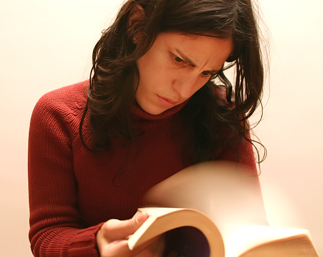
First off let me say that you easily met the challenge and in a different way than many of the others. You have a great idea here. The blur works great with it being nice and smoot. And the clarity and focuson you is good too - nice that there is very little blur if any on your face and body. Your expression lends well to the title and action at hand.
To make this shot better IMO - the colors and lighting seem a bit flat. Better lighting or maybe even shifting to black and white could have helped this image stand out better overall. Maybe a darker background to highlight the edges of the page blur could have helped as well. But - for a last minute shot and entry I think you did great. a 5.9 is nothing to complain about and replacing a pic on your highest rated row is what we all strive for in the end anyways right? Good job.
Tim |
|
 Photographer found comment helpful. Photographer found comment helpful. |
Comments Made During the Challenge  |
|
|
07/02/2006 09:57:40 PM |
| good expression of consternated wonder and the pages are nice and bready. 7 |
|
| Photographer found comment helpful. |
|
|
07/02/2006 09:32:10 PM |
| funy idea! nice blur on the pages. |
|
| Photographer found comment helpful. |
|
|
07/02/2006 07:44:27 PM |
| Cute idea! I think a dark background would work better. The motion is lost on the right side where the pages are in front of the white wall. |
|
| Photographer found comment helpful. |
|
|
07/01/2006 10:09:43 PM |
I think this is a great idea for a "blur" composition. With a little bit of work, the "great idea" could become a great photo. A few things I'd look to improve:
1. Framing: the 2 main elements of the photo - the book and the face - are both a little out of frame. I would have made sure that all of the book, at least, was in-frame.
2. Lighting: the lighting on the face is a little flat. I'd have tried to get a little more contrast happening on the face.
3. Focus: the crispest, best lit part of the composition is the shoulder; well away from what are (I assume) supposed to be the main elements - the face and the book. This draws my eye away from the main elements.
Don't get me wrong, it's a gresat idea, and there are some very good elements in the execution. The blur of the pages and the lighting on the book is well executed, and the expression on the face is just right. If you'd got a better result in the other areas that I mentioned, it would have been great. |
|
| Photographer found comment helpful. |
|
|
07/01/2006 08:03:21 PM |
| Good work. Simple idea but effective. |
|
| Photographer found comment helpful. |
|
|
06/29/2006 09:15:48 PM |
|
|
|
06/29/2006 05:52:56 PM |
Oh come on, that's easy. I'm now reading War & Peace by Leo Tolstoy. That's like 800 pages with letters the size of the letters you see on the buttons of Nokia phones. :)
Nice blur, good angry look. |
|
| Photographer found comment helpful. |
|
|
06/29/2006 02:36:01 AM |
Fun concept. Make sure you white balance the wall so everything doesn't have a yellow cast.
Good job, |
|
| Photographer found comment helpful. |
|
|
06/28/2006 05:32:53 PM |
Great idea, as I think many of the shots in this challenge have got it wrong
excellend subject.
Do you always read this fast ! |
|
| Photographer found comment helpful. |
|
|
06/28/2006 03:17:25 PM |
| neat, I like it, if the blur was less it might look a little more realistic though. |
|
| Photographer found comment helpful. |
|
|
06/28/2006 09:00:19 AM |
|
| Photographer found comment helpful. |
|
|
06/27/2006 11:51:04 PM |
| This was very well done. Great blur. I think it is a great idea for the challenge |
|
| Photographer found comment helpful. |
|
|
06/27/2006 10:40:17 PM |
| She is a quick reader, like Johnny 5. Very nice job, and a wonderful blur effect that really adds to the image. |
|
| Photographer found comment helpful. |
|
|
06/27/2006 02:24:05 PM |
| Ha! I thought of having fun with books pages, but it never looked as good as yours. Simple, yet all effecitve. |
|
| Photographer found comment helpful. |
|
|
06/27/2006 12:50:36 PM |
| I like the originality of this, I like how everything else is clean except the motion. My only complaint is the fading from white to slight pink at the bottom. |
|
| Photographer found comment helpful. |
|
|
06/27/2006 06:23:47 AM |
| original idea and well puy together although a little less blur might have worked better 8 |
|
| Photographer found comment helpful. |
|
|
06/27/2006 01:45:48 AM |
| The look on her face is priceless, and you did a good job of using the motion blur as a storytelling element. The colors are kind of washed out, though, and the cropping is so tight her face is a little too high. Still, a 7! |
|
| Photographer found comment helpful. |
|
|
06/26/2006 11:14:42 PM |
| well done...lighting could have been a bit better as it' a little flat, but good job |
|
| Photographer found comment helpful. |
|
|
06/26/2006 08:30:55 PM |
| Nice idea and well executed. |
|
| Photographer found comment helpful. |
|
|
06/26/2006 02:29:15 PM |
| Very clever idea for the challenge. Good look of frustration from your model. Well done! |
|
| Photographer found comment helpful. |
Home -
Challenges -
Community -
League -
Photos -
Cameras -
Lenses -
Learn -
Help -
Terms of Use -
Privacy -
Top ^
DPChallenge, and website content and design, Copyright © 2001-2025 Challenging Technologies, LLC.
All digital photo copyrights belong to the photographers and may not be used without permission.
Current Server Time: 03/12/2025 02:43:53 AM EDT.