| Author | Thread |
|
|
07/11/2006 07:27:47 PM |
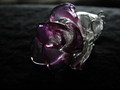
Originally posted by niranjan:
what is so glassy about this? |
its a stained GLASS cockateil. |
|
Comments Made During the Challenge  |
|
|
07/04/2006 01:23:43 PM |
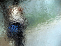
| Nice attempt but I feel the image is overall quite flat, possibly due to the glass part looking a little out of focus or just very soft. |
|
 Photographer found comment helpful. Photographer found comment helpful. |
|
|
07/04/2006 11:11:18 AM |
| Nice idea, pity the lighting isn´t all that good and also the shot seems to have syndromes of hand shake, was the light not enough for you to get a decent shutterspeed? Wish this was lit more mysteriously and was crystal clear and sharp, then I really would have liked it. Anyway, nice idea and keep at it, this is very promising, you just need to work on your technical skills but the imagination and creativity seems to be there. |
|
| Photographer found comment helpful. |
|
|
07/04/2006 05:59:12 AM |
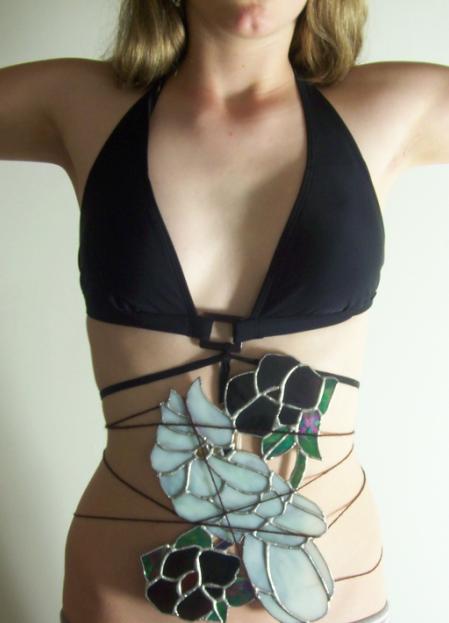
| A pretty un-PC play on words, but it gave me a smile. |
|
| Photographer found comment helpful. |
|
|
07/03/2006 10:06:16 AM |
| Would have preferred this to be sharper, but interesting idea. |
|
| Photographer found comment helpful. |
|
|
07/03/2006 02:40:53 AM |
| your entry is too much OOF and could use some contrast. |
|
| Photographer found comment helpful. |
|
|
07/02/2006 09:08:03 AM |
| Very interesting vision. Definitely thinking outside the box! |
|
| Photographer found comment helpful. |
|
|
07/01/2006 06:35:28 PM |
| Different approach to the subject! I like that you cut her head off but am not sure about the arms straight out and cut off. Overall the picture seems very soft. |
|
| Photographer found comment helpful. |
|
|
06/30/2006 04:55:34 PM |
| It's hard to say this, but it's actually not that pleasing to my eye. Maybe coz I'm not interested in the glass. Too bright on the right side of photo. |
|
| Photographer found comment helpful. |
|
|
06/30/2006 03:18:14 PM |
| this could be much better with softer lighting and more contrast. extra point for such an out of the box idea though. |
|
| Photographer found comment helpful. |
|
|
06/30/2006 12:18:34 PM |
| This just doesn't seem to fit together. |
|
|
|
06/29/2006 08:09:23 AM |
| pity it's so blurry as it would have been a great shot |
|
| Photographer found comment helpful. |
|
|
06/28/2006 07:34:11 PM |
| Ummmmm........ ok, this could have beeen improved by softer lighting, more contrast and cropping down to under the subject's bustline... |
|
| Photographer found comment helpful. |
|
|
06/28/2006 12:21:29 PM |
| what is so glassy about this? |
|
|
|
06/28/2006 08:05:02 AM |
I don't get it.
Overexposed to the left.
A bit out of focus. |
|
| Photographer found comment helpful. |
Home -
Challenges -
Community -
League -
Photos -
Cameras -
Lenses -
Learn -
Help -
Terms of Use -
Privacy -
Top ^
DPChallenge, and website content and design, Copyright © 2001-2025 Challenging Technologies, LLC.
All digital photo copyrights belong to the photographers and may not be used without permission.
Current Server Time: 03/12/2025 03:04:44 AM EDT.