| Author | Thread |
Comments Made During the Challenge  |
|
|
07/11/2006 09:41:19 PM |
| Ha... funny how in the voting your shot comes right after the colored pencils in the exact same set up. I really like the idea, but maybe some different colored pens/pencils would make it "pop" a bit more. Nice shot though. |
|
 Photographer found comment helpful. Photographer found comment helpful. |
|
|
07/11/2006 05:36:27 PM |
|
| Photographer found comment helpful. |
|
|
07/11/2006 08:38:22 AM |
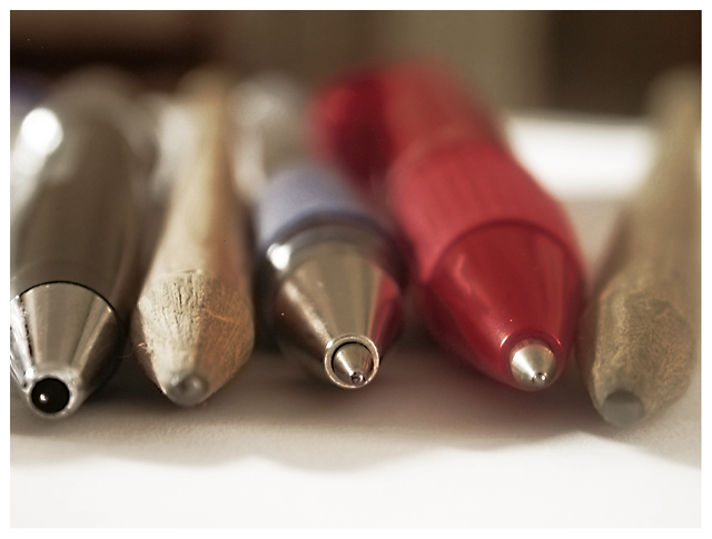
| A distant relation to the challenge... too distant. |
|
|
|
07/10/2006 09:57:22 PM |
| needs more depth of field |
|
| Photographer found comment helpful. |
|
|
07/09/2006 08:15:18 AM |
|
| Photographer found comment helpful. |
|
|
07/07/2006 05:15:20 PM |
|
| Photographer found comment helpful. |
|
|
07/07/2006 11:07:02 AM |
What I like: Sharp focus, interesting colors.
What I didn't like: I wish it was exactly the tip of each writing device that was exactly in focus. |
|
| Photographer found comment helpful. |
|
|
07/07/2006 09:25:29 AM |
| The transition from the white base to the dark background gives the impression that the photo is not level. Cropping the transtion out might help. The colors, textures, and shadows work well together. |
|
| Photographer found comment helpful. |
|
|
07/06/2006 08:06:18 PM |
| I like this, but I think I would prefer the red and blue pens to be separated by the pencils (metal/wood/metal/wood/metal) for a continuous pattern. |
|
| Photographer found comment helpful. |
|
|
07/06/2006 02:38:35 PM |
| I am sure you would disagree or you wouldn't have entered the photo in this challenge, but IMO DNMC. |
|
|
|
07/06/2006 07:55:45 AM |
| Ahhh, pencil projects... I did a big 200+ shot pencil project myself and I learned a load about fields of focus... the durned buggers aren't always flat and in plane with the lens... |
|
| Photographer found comment helpful. |
|
|
07/06/2006 06:04:32 AM |
| Good bokeh and awesome macro. |
|
| Photographer found comment helpful. |
|
|
07/05/2006 06:43:38 PM |
Nice variety.
Like the focus, sharp to soft. |
|
| Photographer found comment helpful. |
|
|
07/05/2006 02:34:32 AM |
| This would have been better if you could have got all the end of the pens/pencils in focus |
|
| Photographer found comment helpful. |
|
|
07/05/2006 01:15:26 AM |
| Wonderful DOF, not the most exciting objects. |
|
| Photographer found comment helpful. |