Greetings from the Critique Club!
First Impression:
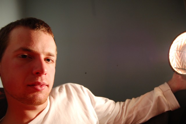
Feels as if not much thought was put into the setup here. Almost looks as if the person in the pic has both arms outstretched and is trying to take a self portrait. With no title, there is no help to figure out what the photographer was trying to get across.
Composition/Background:
What I do like about the composition is how my eye goes between the light and the face. However, I find it odd that both the ear and hand are cut off. It feels incomplete. The background isn't very interesting, and that sensor dust just jumps right out at you.
Technicals:
The photo has a yellowish cast to it. Changing your white balance setting before shooting may have helped. It is also a bit soft/out of focus. Using a faster shutter speed, a tripod, or boosting the sharpen in the camera settings all could have helped.
Overall:
You noted in your comments that you wanted to put the light source in the picture because it is usually supposed to be kept from view. That is true in many cases, but there are also plenty of times (sunsets, fireworks, silhouettes etc.) when the light source is a vital part of the shot. Working with the person and lamp in this particular shot, a candid of them working or reading next to the lamp (with it still creativly lighting them) would have probably scored you higher. Just as one commenter noted, it would be nice if there was more expression or story in the picture.
I hope you found this critique helpful. Please feel free to PM me if you have any questions. |