| Author | Thread |
Comments Made During the Challenge  |
|
|
07/05/2006 11:49:12 AM |
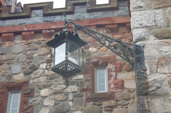
| This looks overexposed and it lacks fine detail. If the lantern was your subject more of the background should have been eliminated. This would best be achieved by getting in closer and finding an angle of view that places the subject against a simple background. In this case you may have been able to find a viewpoint that eliminated the windows, leaving just the stones to add context to the main subject. The biggest problem in terms of composition for me is the strip of blown out sky that can be seen at the top. |
|
|
|
07/05/2006 10:42:34 AM |
| Very interesting shot. Most people would walk right by this and not think about shooting it. 7 plus 1 for your keen eye. 8 |
|
|
|
07/05/2006 01:29:24 AM |
| You need to increase the contrast |
|
|
|
07/04/2006 08:43:42 PM |
| very nice job, but, it seems washed out, or to light, something is stealing away the natural color, nice job just the same! |
|
|
|
07/03/2006 09:12:07 AM |
| like the different shapes in this photo and the colours. |
|
Home -
Challenges -
Community -
League -
Photos -
Cameras -
Lenses -
Learn -
Help -
Terms of Use -
Privacy -
Top ^
DPChallenge, and website content and design, Copyright © 2001-2025 Challenging Technologies, LLC.
All digital photo copyrights belong to the photographers and may not be used without permission.
Current Server Time: 03/15/2025 06:30:50 PM EDT.