Greetings from the Critique Club!
First Impression:
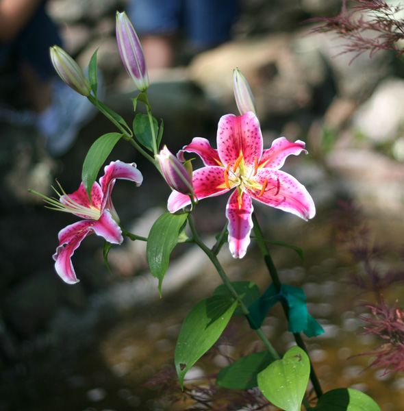
Nice vivid coloring in the flower. Background is a bit busy and distracting. I like the angle, it's a bit different than a plain old straight flower, but overall the photo still doesn't have a lot of "wow" to bump up the score.
Composition/Background:
As I mentioned in my first impression, I like the angle (though some folks aren't such a big fan of that), and the background is a bit busy for me. I like the bokeh you got from the ground, but I find the blues and oranges (people?) a bit unnatural. I also can't quite figure out what the blue-green thing is on the stem of the flower... a ribbon? My suggestions would have been to shoot from a slightly higher angle to avoid getting the people in the background, or to maybe have cropped a bit more from the bottom and right so that the flower itself isn't so centered.
Technicals:
Looks like you had some nice lighting here with the flower petals getting the majority of it. You handled it nicely, with only a few tiny areas of the white being blown out. Focus seems sharp on the flower as it should be and the dof is well done.
Post Processing:
Not sure what post processing went into this shot since you made no mention of it in your Photographer's Comments. Perhaps a slightly different crop would have helped to not only remove some of the busy background, but also would have given us more of a look at the interesting details of the flower itself. Also, a slight run through the USM filter might help to sharpen it up a bit.
Last Thoughts:
A nice photo, but in a challenge where voters are looking at hundreds of flowers, to get a higher score you really need to make yours stand out which is why I think your score ended up at a 5.000. Seems that two of the commenters from the voting period also found the background to be a distraction, which is something to keep in mind when framing your picture before you click the shutter.
I hope you found this critique helpful. Please feel free to PM me if you have any questions. |