| Author | Thread |
|
|
07/13/2006 01:43:57 PM |
Greetings from the Critique Club
Well, here is a nice little softspoken entry that seems to have received 'average' votes.
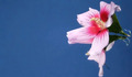
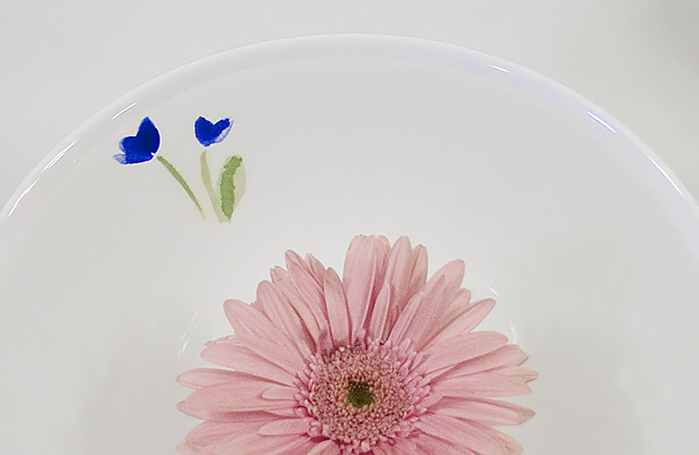
I like the lighting on this. It tames the plate which could have become dominant and intrusive. Perhaps just a little more lighting on the pink flower to give a bit more depth...
The one thought that stands out is a point that is made in my art classes once in a while. And that is composition. The "rule" (and yes, they are made to be broken) is that we chose one, three or five items in a composition. The reason being, especially for the two items, is that the viewer bounces back and forth between the two objects never knowing where to concentrate his energy, and, confused, simply moves on.
Anyhow, a little more pizzazz and maybe one more flower might make this extra special.
Continued good luck in future challenges. You have some nice work.
Alice |
|
 Photographer found comment helpful. Photographer found comment helpful. |
Comments Made During the Challenge  |
|
|
07/08/2006 06:35:44 PM |
| Very nice setup but it looks dull and sort of washed out. |
|
| Photographer found comment helpful. |
|
|
07/05/2006 05:05:28 PM |
| Great photo. Colors are really nice. Great job! |
|
| Photographer found comment helpful. |
|
|
07/05/2006 01:50:12 PM |
| I wish for lighting that is a little less flat on the flower. It looks really washed out. |
|
| Photographer found comment helpful. |
|
|
07/03/2006 08:46:35 PM |
|
| Photographer found comment helpful. |
|
|
07/03/2006 01:39:59 AM |
|
| Photographer found comment helpful. |
Home -
Challenges -
Community -
League -
Photos -
Cameras -
Lenses -
Learn -
Help -
Terms of Use -
Privacy -
Top ^
DPChallenge, and website content and design, Copyright © 2001-2025 Challenging Technologies, LLC.
All digital photo copyrights belong to the photographers and may not be used without permission.
Current Server Time: 03/15/2025 02:00:31 AM EDT.