| Author | Thread |
|
|
11/18/2006 11:31:51 PM |
|
Comments Made During the Challenge  |
|
|
07/11/2006 09:02:09 PM |
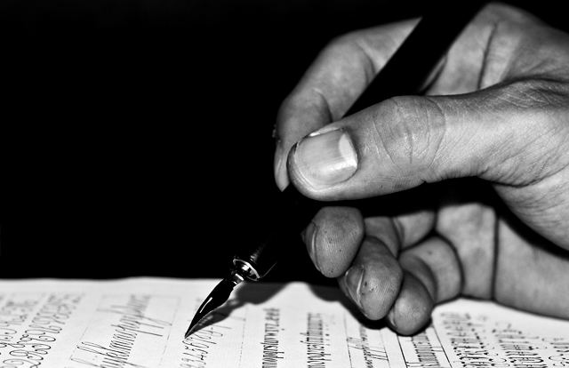
| a little too centered, would have liked to see a little more paper toward the top. Other than that, excellent. Great detail on the fingers. |
|
 Photographer found comment helpful. Photographer found comment helpful. |
|
|
07/11/2006 08:34:17 AM |
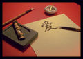
| Oh, I just love calligraphy!!! It is only slightly off the subject of the challenge though. Alas. |
|
|
|
07/10/2006 07:51:49 AM |
| I would have prefered the page half written, but then again it is a great tech picture. WEll done |
|
| Photographer found comment helpful. |
|
|
07/09/2006 05:47:45 PM |
|
|
|
07/08/2006 10:23:54 PM |
|
|
|
07/08/2006 08:46:12 PM |
| It would have gotten higher marks from me if the pen didn't blend in with the background. |
|
| Photographer found comment helpful. |
|
|
07/07/2006 04:55:25 PM |
| Great shot! Love the contrast in BW. |
|
| Photographer found comment helpful. |
|
|
07/07/2006 09:18:07 AM |
| The tip of the pen is tack sharp and well positioned. The hand appears to have ink on it, which doesn't translate to the paper itself. I would expect to see smudging on the paper since he is resting his hand on top of ink that transferred to his hand. |
|
| Photographer found comment helpful. |
|
|
07/06/2006 08:32:40 PM |
| Lighting could be improved. Too contrasty for my tastes. |
|
| Photographer found comment helpful. |
|
|
07/06/2006 06:52:33 PM |
| The black of the pen blends in well with the background. You might get some flames thrown your way because of that, but I kind of like it. 9 |
|
| Photographer found comment helpful. |
|
|
07/06/2006 06:10:12 AM |
| Nice tones and great details. |
|
| Photographer found comment helpful. |
|
|
07/06/2006 03:46:19 AM |
| The lighting and angle seem to work against this image. |
|
|
|
07/05/2006 07:47:03 PM |
| Nice mooody use of light and dark. Well framed, too; though I would have experimented with having the paper at a bit more of an angle. |
|
| Photographer found comment helpful. |
|
|
07/05/2006 07:37:02 PM |
| Nice if a little faux. 8. |
|
| Photographer found comment helpful. |
|
|
07/05/2006 06:51:05 PM |
I love that you opted to shoot this in black and white.
It adds character that I think would have been lost in color.
Gives the feel of age.
Beautiful use of lighting and focus as well. |
|
| Photographer found comment helpful. |
|
|
07/05/2006 02:10:57 PM |
| i like the grittiness of it. the high contrast b&w makes it all the better! |
|
| Photographer found comment helpful. |
|
|
07/05/2006 11:24:09 AM |
| Wonderful focus, the highlight on the thumbnail keeps attracting my eye though... 7 |
|
| Photographer found comment helpful. |
|
|
07/05/2006 09:08:40 AM |
| lighting is quite harsh and contrasty, sorry |
|
|
|
07/05/2006 12:39:51 AM |
|
Home -
Challenges -
Community -
League -
Photos -
Cameras -
Lenses -
Learn -
Help -
Terms of Use -
Privacy -
Top ^
DPChallenge, and website content and design, Copyright © 2001-2025 Challenging Technologies, LLC.
All digital photo copyrights belong to the photographers and may not be used without permission.
Current Server Time: 04/26/2025 11:30:40 AM EDT.