| Author | Thread |
|
|
07/13/2006 10:46:41 PM |
| Well, *I* think it's neat, both in concept and in execution. :) |
|
 Photographer found comment helpful. Photographer found comment helpful. |
|
|
07/12/2006 07:46:15 AM |
It's unfortunate that so many people have a closed concept of what stationery means, as I'm sure your score suffered from it.
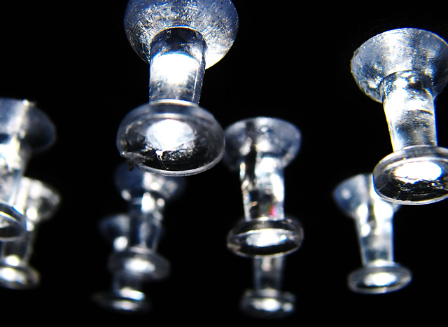
What I like about this shot is the simplicity, the creative lighting and the focus of the two pins in the front. I think I would have preferred a little more DOF to either just get the closest pin totally in focus, or perhaps even to get a few more of the pins a little more focused...not sure which would be better. After some time, I finally noticed the bit of red on one of the pins, which might be a distraction for some.
Don't let your score or the DNMC comments get you down. Just learn what you can from the shot and the comments, and use that in your future challenges :) |
|
| Photographer found comment helpful. |
Comments Made During the Challenge  |
|
|
07/11/2006 07:43:46 AM |
| Another inventive composition, slightly related to the challenge subject. Good macro photo, but not exactly statonery. |
|
| Photographer found comment helpful. |
|
|
07/10/2006 12:30:27 PM |
| very nice photo, however dnmc imo |
|
|
|
07/10/2006 08:12:09 AM |
| I'm glad to see you didn't go overboard here, good shot |
|
| Photographer found comment helpful. |
|
|
07/07/2006 05:40:27 PM |
| pushing stationery to the limits i see :) ... like all those people who will say "define pushing... define limits..." |
|
| Photographer found comment helpful. |
|
|
07/07/2006 11:41:56 AM |
What I like: Great idea, fun title. Good focus and light.
What might improve it: Getting the DOF so that it includes one whole pushpin may have helped, not sure. |
|
| Photographer found comment helpful. |
|
|
07/07/2006 09:25:24 AM |
| The lighting is very effective and I like your usage of the subject matter. I would like to have seen less overlap of the two pushpins on the left and the red reflection in the center pushpin competes with the pushpins that are in focus as a focal point. |
|
| Photographer found comment helpful. |
|
|
07/06/2006 08:17:45 PM |
| Everything is too blurry. These are difficult to shoot, but the DOF here is way too thin. |
|
| Photographer found comment helpful. |
|
|
07/06/2006 02:14:56 PM |
| I am sure you would disagree or you wouldn't have entered the photo in this challenge, but IMO DNMC. |
|
|
|
07/06/2006 07:00:51 AM |
| A different take on the subject...nicely done. |
|
| Photographer found comment helpful. |
|
|
07/05/2006 08:24:01 PM |
| There's a good idea lurking in here somewhere. But this misses the mark, I'm afraid. |
|
| Photographer found comment helpful. |
|
|
07/05/2006 12:49:36 PM |
|
| Photographer found comment helpful. |
|
|
07/05/2006 07:57:32 AM |
| that's a a great take on a pushpin, excellent shot makes you look twice...they look like chess pieces at first, but on closer inspection...well done |
|
| Photographer found comment helpful. |
|
|
07/05/2006 12:25:27 AM |
| Excellent. This image is very appealing. Great lighting. |
|
| Photographer found comment helpful. |
Home -
Challenges -
Community -
League -
Photos -
Cameras -
Lenses -
Learn -
Help -
Terms of Use -
Privacy -
Top ^
DPChallenge, and website content and design, Copyright © 2001-2025 Challenging Technologies, LLC.
All digital photo copyrights belong to the photographers and may not be used without permission.
Current Server Time: 03/11/2025 01:09:25 PM EDT.