| Author | Thread |
Comments Made During the Challenge  |
|
|
07/11/2006 05:50:40 PM |
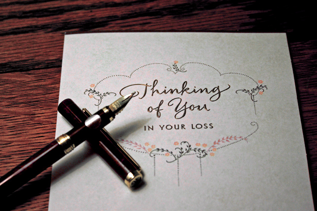
I like the composition and idea.
I think you used narrow DOF to focus on the letter, but the pen is distracting me. I think if it had been in focus, it wouldn't do that. Go figger.
As for the paper itself, it's not quite bright enough. I get the impression of someone writing this in a very dim room. |
|
 Photographer found comment helpful. Photographer found comment helpful. |
|
|
07/11/2006 03:01:53 PM |
| Great photo - but it would have had even more impact if the words were actually written in handwriting instead of being a printed card..or was it? |
|
| Photographer found comment helpful. |
|
|
07/11/2006 07:53:30 AM |
| Actually, this shows a beautiful piece of stationery, that is undoubtedly tied to an unfortunate event. the photo itself isn't the clearest, but it clearly conveys a message. |
|
| Photographer found comment helpful. |
|
|
07/10/2006 08:25:43 AM |
| Wondering if the image would have been improved by also having the pen in focus? |
|
| Photographer found comment helpful. |
|
|
07/08/2006 03:43:34 PM |
| Would have liked to see more balanced framing on this with less of the table above, and some showing below. |
|
| Photographer found comment helpful. |
|
|
07/07/2006 05:19:35 PM |
| nice idea, but needs more. casket in the background, etc. to make it really click. |
|
| Photographer found comment helpful. |
|
|
07/07/2006 03:16:41 PM |
|
| Photographer found comment helpful. |
|
|
07/07/2006 09:21:51 AM |
| I would have liked to see the tip of the pen in focus with the paper. The composition is well thought out and overall, this is a very nice image. |
|
| Photographer found comment helpful. |
|
|
07/06/2006 08:47:02 PM |
| Nicely done, the pen set up the way you did is an added touch that adds to the interest. |
|
| Photographer found comment helpful. |
|
|
07/06/2006 07:59:25 PM |
| An increased DOF where the pen is in focus would be better. Nice idea. |
|
| Photographer found comment helpful. |
|
|
07/06/2006 01:44:05 PM |
| I like the idea in this photo. I think the pen should be sharper, and the paper should be aligned better. The pen to me is a major element of the photo--but it's a bit frustrating to have it so out of focus in the shot. |
|
| Photographer found comment helpful. |
|
|
07/06/2006 06:05:05 AM |
| Oh such a sad letter but a pretty design. |
|
| Photographer found comment helpful. |
|
|
07/05/2006 07:05:36 PM |
|
| Photographer found comment helpful. |
|
|
07/05/2006 03:19:20 PM |
| interesting shot for a stationary catalog... |
|
| Photographer found comment helpful. |
|
|
07/05/2006 10:29:55 AM |
|
| Photographer found comment helpful. |
|
|
07/05/2006 01:17:24 AM |
| good job! personally i would have liked the pen to be more in focus. |
|
| Photographer found comment helpful. |
Home -
Challenges -
Community -
League -
Photos -
Cameras -
Lenses -
Learn -
Help -
Terms of Use -
Privacy -
Top ^
DPChallenge, and website content and design, Copyright © 2001-2025 Challenging Technologies, LLC.
All digital photo copyrights belong to the photographers and may not be used without permission.
Current Server Time: 03/11/2025 02:56:45 PM EDT.