| Author | Thread |
|
|
09/03/2003 12:26:13 AM |
| Zeus' Top Pic(k)s: 2. Place |
|
 Photographer found comment helpful. Photographer found comment helpful. |
Comments Made During the Challenge  |
|
|
09/02/2003 09:34:16 PM |
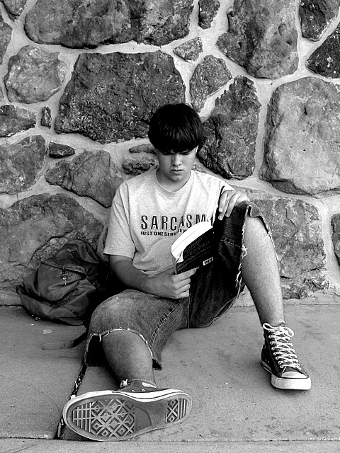
| nice composition and tones. I would like this more without the words on the shirt. |
|
| Photographer found comment helpful. |
|
|
09/02/2003 12:31:01 PM |
| Interesting portrait, the foot in the foreground is a nice touch. Interesting background, but could perhaps do with more contrast with subject. Composition a bit too centred for my taste. 7 |
|
| Photographer found comment helpful. |
|
|
09/02/2003 04:28:55 AM |
| Really captures the feeling of being at school. Simple but effective. My favorite of the challenge. 10. |
|
| Photographer found comment helpful. |
|
|
09/01/2003 09:35:15 PM |
A credible straightforward shot with a very 'real' feel to it, technically aedequate.
I admit that the wall is not without interest, but question the need to iclude as much of it as has been done. I feel similarly about the central composition, given the restful, uneven posture and casual attire of the subject. I can imagine a more charged and less static image, if the rule of third had been considered for this picture.
I like the choice of b & w. It's less likely to be viewed as a snapshot and, instead, seasons the picture.
|
|
| Photographer found comment helpful. |
|
|
09/01/2003 08:18:33 PM |
| The choice of black and white seems to put a bit of a mood on the image, which I suppose could appropriately compliment the concentrated look on his face also. The wall background gives a nice contrast to the rest of the image. Unfortunately there isnt much detail on his face and so the shot relies a lot on his body language. It's a good shot, but I think I may have preferred it had it had some more drama, whether that be lighting, pose, or position in the frame. |
|
| Photographer found comment helpful. |
|
|
09/01/2003 01:02:09 PM |
| Hmmm.... wondering if it would have been better in colour... |
|
| Photographer found comment helpful. |
|
|
09/01/2003 11:53:29 AM |
| What I like most about your shot is I get the sense you are on his level when you took it, i.e. you knelt down. It works well in B&W too. Subject is convincing. Well done. |
|
| Photographer found comment helpful. |
|
|
09/01/2003 11:28:26 AM |
| I had same idea. Good shoot. |
|
| Photographer found comment helpful. |
|
|
09/01/2003 10:25:11 AM |
| I like this image a lot - since I am having to learn a lot about cropping I wondered if you had thought of cropping this and pulling the figure and the texture of the stones in more tightly |
|
| Photographer found comment helpful. |
|
|
09/01/2003 10:12:53 AM |
| Nice contrast. Model does not appear to be so "posed". I think even the shirt he is wearing depicts a teen aged student. Well done. |
|
| Photographer found comment helpful. |
|
|
09/01/2003 05:50:12 AM |
| Nice pic, it would maybe be better if the subject was off-center. Good contrast though! |
|
| Photographer found comment helpful. |
|
|
09/01/2003 12:35:35 AM |
| cool shot...looks like a yearbook photo shot=`) |
|
| Photographer found comment helpful. |
Home -
Challenges -
Community -
League -
Photos -
Cameras -
Lenses -
Learn -
Help -
Terms of Use -
Privacy -
Top ^
DPChallenge, and website content and design, Copyright © 2001-2025 Challenging Technologies, LLC.
All digital photo copyrights belong to the photographers and may not be used without permission.
Current Server Time: 03/15/2025 10:12:47 AM EDT.