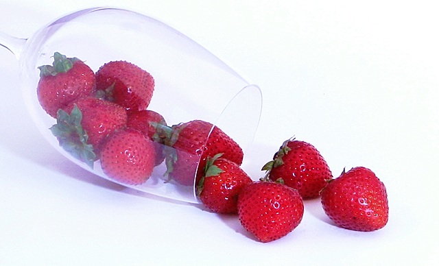
playing around with a quasi light box for the first time. I've spent more time on this challenge than I probably should have. Started out shooting black stones... that was boring, so I moved on to silver marbles. That caused too many odd reflections, so then I tried blueberries, didn't like them, so I did raspberries. Still boring, so I threw in a wineglass. Still wasn't colorful enough so I went and got strawberries. I'm still not completely happy with this. The glass isn't clear enough, and I obviously still need to learn a lot in the way of lighting. This is shot inside a lightbox made out of white foam board with various desk lamps (I pillaged from all my kids' desks) shining into it. I taped a piece of black paper part way up the background to get some separation between the glass and the background. When I added some to the front, the glass got a little less 'milky' looking, but I still couldn't get the lighting the way I wanted it. But I'm giving up and going to my daughters soccer game, so this is as good as it's going to get.
pp - adjusted the levels and curves a bit, resized and sharpened (gee.. seems like those are the steps I always take.)
Statistics
Place: 103 out of 219 Avg (all users): 5.4180 Avg (commenters): 8.3333 Avg (participants): 5.2000 Avg (non-participants): 5.5962 Views since voting: 577 Views during voting: 257 Votes: 189 Comments: 5 Favorites: 0
For me, this suffers on two levels. First and foremost is that the light is just too harsh. The whites are super bright and fog up the glass. The color on the strawberries seems washed out in comparison. Overall, the image comes across looking fairly flat.
The lightbox did a good job of eliminating the shadows, but perhaps the desk lamps could do with some diffusing, say with white muslin or wax paper.
Don't be afraid to bump up the color saturation.
One of my tricks for toning down bright spots is a reverse S-curve. In a normal S curve, you select the three points (lower, mid and upper), pull the lower point down a touch (deepens colors and shadows) and the upper point is pulled up (brightens highlights, lightens shadows). To tone down super brights, do exactly the opposite - lower point goes up, upper point goes down. Then I usually do a second curves layer, also 3-points, in which I pull the lower and center down just a touch, and leave the upper where it is. I'm betting this technique would work some magic here. :)
I'm surprised this got so few comments and the low score. I'm guessing the foggy glass was the issue here. Most glass shots I've seen that has that tonal range to die for is lit from the back as in bounced off the back wall and not directly on the glass itself. Perhaps try that.
Btw, the lighting on the strawberries came out very well and I like the choices made with the background and the composition in general. This is a fairly good image. I just think maybe it got nitpicked too much.