| Author | Thread |
Comments Made During the Challenge  |
|
|
07/18/2006 07:48:57 PM |
| this picture tells a story, creates a world. 7 |
|
 Photographer found comment helpful. Photographer found comment helpful. |
|
|
07/18/2006 10:49:05 AM |
| Nice job in the PP, love the sepia toning and tonal range of this photo. |
|
| Photographer found comment helpful. |
|
|
07/18/2006 02:03:54 AM |
| I like the mood of this one, but I don't get the title. Also a little disturbed by chopped off light at top of photo. Maybe crop it a bit differently. |
|
| Photographer found comment helpful. |
|
|
07/15/2006 08:57:24 PM |
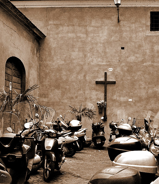
| I like the contrast of the machinery with the pristine, quiet nature of the house of worship. Toning is lovely. |
|
| Photographer found comment helpful. |
|
|
07/15/2006 07:42:32 PM |
| Sorry, I'm not sure I understand. |
|
| Photographer found comment helpful. |
|
|
07/14/2006 05:40:16 PM |
| I like the idea here, the distracting elements for me though are the half a window and two-thirds of a lamp near the top right. It bugs me when things get chopped off like that. I think the picture looks a lot better if it's cropped in a line below the guttering. |
|
| Photographer found comment helpful. |
|
|
07/13/2006 11:24:28 PM |
| this is a great image. i love it! |
|
| Photographer found comment helpful. |
|
|
07/13/2006 12:05:08 PM |
| Nice shoot and works good in sepia. Only I would cropped bit differently...just above the door. |
|
| Photographer found comment helpful. |
|
|
07/13/2006 11:26:12 AM |
| I really like this picture for it's irony. I don't think it'll do well tho. Not certain people will get it. I also like the color tone of the image. Good luck. |
|
| Photographer found comment helpful. |
|
|
07/12/2006 04:14:36 PM |
| The sepia color tone is a nice choice. Great subject, but the light and window at the top are distracting and don't add to the subject. I think cropping the photo into a square would be an interesting improvement. Also, it seems a bit crooked. Overall, 8. |
|
| Photographer found comment helpful. |
|
|
07/12/2006 03:06:31 AM |
provocative with the title; but cute without.
I like the composition, good work.
by the way, this piece here reminds me of the works by JJBeguin (that's a compliment) |
|
| Photographer found comment helpful. |
Home -
Challenges -
Community -
League -
Photos -
Cameras -
Lenses -
Learn -
Help -
Terms of Use -
Privacy -
Top ^
DPChallenge, and website content and design, Copyright © 2001-2025 Challenging Technologies, LLC.
All digital photo copyrights belong to the photographers and may not be used without permission.
Current Server Time: 03/16/2025 05:25:58 AM EDT.