| Author | Thread |
|
|
08/03/2006 09:32:39 AM |
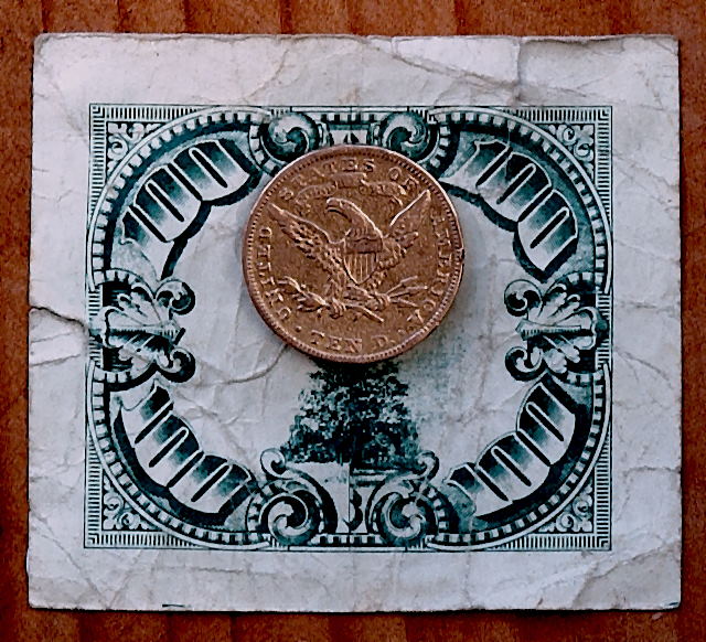
| TEN D. (Denver Mint) Gold? Copper? |
|
 Photographer found comment helpful. Photographer found comment helpful. |
Comments Made During the Challenge  |
|
|
07/16/2006 12:22:34 AM |
what I like:
the picture is nice and sharp and the lighting doesn't seem too bad.
What I don't like:
overall the picture seems a bit too bland for me. Some of the details on the coin are hard to make out and the way the bill is folded makes it a little bit confusing. |
|
| Photographer found comment helpful. |
|
|
07/14/2006 05:04:24 PM |
| I like the contrasts between the backround, the paper and the coin. |
|
| Photographer found comment helpful. |
|
|
07/12/2006 04:56:06 PM |
| The background that the money is resting on is a bit distracting IMHO |
|
| Photographer found comment helpful. |
|
|
07/11/2006 01:17:05 AM |
| I really like how the different colors play off each other and the mixture of textures, wrinkled paper and worn dime(?). The color on the dime looks a bit odd to me though, not the typical silver but more copper.. so maybe its a 10 dollar coin. I wish the coin had just a bit more detail pulled from it, as it is a main subject to the image. The lighting looks good though slightly muted. I think the composition could be better to add some drama - perhaps some interesting way of folding the paper beneath the coin or creative use of light to play up the word "ten" on the coin. As it is, its pretty static and flat and needs more dimension. 4 |
|
| Photographer found comment helpful. |
Home -
Challenges -
Community -
League -
Photos -
Cameras -
Lenses -
Learn -
Help -
Terms of Use -
Privacy -
Top ^
DPChallenge, and website content and design, Copyright © 2001-2025 Challenging Technologies, LLC.
All digital photo copyrights belong to the photographers and may not be used without permission.
Current Server Time: 03/12/2025 03:14:20 PM EDT.