| Author | Thread |
Comments Made During the Challenge  |
|
|
07/18/2006 05:21:43 PM |
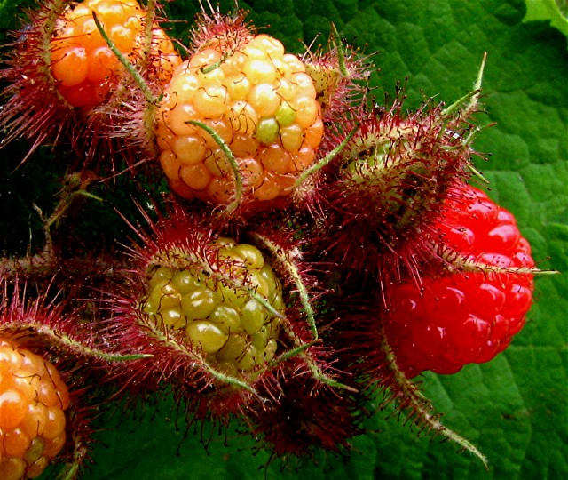
| Really great detail in this shot. Careful Picking... |
|
 Photographer found comment helpful. Photographer found comment helpful. |
|
|
07/18/2006 11:08:11 AM |
| Cool idea.....but poorly exicuted. I totally think this could have been a winner though |
|
|
|
07/17/2006 05:19:48 PM |
|
| Photographer found comment helpful. |
|
|
07/15/2006 05:37:42 PM |
| You're kidding me...they look gross...and I like Raspberries. Well, I used to anyway...thanks! It's certainly a representation of progression though. (Some selective sharpening might be nice?) |
|
|
|
07/14/2006 11:19:30 PM |
| Good depiction of the fruit's natural progress. |
|
| Photographer found comment helpful. |
|
|
07/14/2006 03:58:30 PM |
| Interesting. It's funny to see them change. In a way it looks a bit freaky though. I like the different textures. |
|
| Photographer found comment helpful. |
|
|
07/14/2006 10:00:32 AM |
| Excellent macro, good comp to show the progression of growth. |
|
| Photographer found comment helpful. |
|
|
07/14/2006 09:37:55 AM |
| nice & delecious shot ! ;) |
|
| Photographer found comment helpful. |
|
|
07/13/2006 10:16:25 PM |
| Love the color contrast. Something about the bottom edge is not quite working...my eye wants to drop off. It may be a little top heavy... |
|
| Photographer found comment helpful. |
|
|
07/13/2006 10:14:40 AM |
| Nice concept but can't tell if it's oversharp or the exposure os odd or...something is up. |
|
|
|
07/12/2006 09:58:24 PM |
| I do like this shot - doing the old classic complementary colours thing. I believe I would have liked it more rotated counter-clockwise 90 degrees (or so). This I think would have been better balanced, and led the eye through the progress of unripe in the foreground and ripe in the background. |
|
| Photographer found comment helpful. |
|
|
07/12/2006 06:57:58 PM |
| looks like charly and the chockolet factory! nice job |
|
| Photographer found comment helpful. |
|
|
07/12/2006 03:48:02 PM |
| Neat photo. Personally, the colors are too saturated and look unnatural and weird to me. |
|
| Photographer found comment helpful. |
|
|
07/12/2006 12:22:51 PM |
| Extremely sharp focus, nice composition, and eye-popping rich colors. Well done! |
|
| Photographer found comment helpful. |
Home -
Challenges -
Community -
League -
Photos -
Cameras -
Lenses -
Learn -
Help -
Terms of Use -
Privacy -
Top ^
DPChallenge, and website content and design, Copyright © 2001-2025 Challenging Technologies, LLC.
All digital photo copyrights belong to the photographers and may not be used without permission.
Current Server Time: 04/28/2025 11:21:45 AM EDT.