| Author | Thread |
|
|
07/26/2006 09:07:19 PM |
Originally posted by MikeOwens:
One of my favs of the comp. I would like to see a more contrast and a B&W version. Well done |
Thank you. I was intending this to be a B&W shot, but didn't like what was coming out at the conversion stage. The yellow was hard to separate from the grey :(. I'd like to hear any suggestions for successful B&W conversion of this image. |
|
|
|
07/26/2006 04:34:04 PM |
One of my favs of the comp. I would like to see a more contrast and a B&W version. Well done
|
|
 Photographer found comment helpful. Photographer found comment helpful. |
|
|
07/26/2006 10:57:03 AM |
Originally posted by BradP:
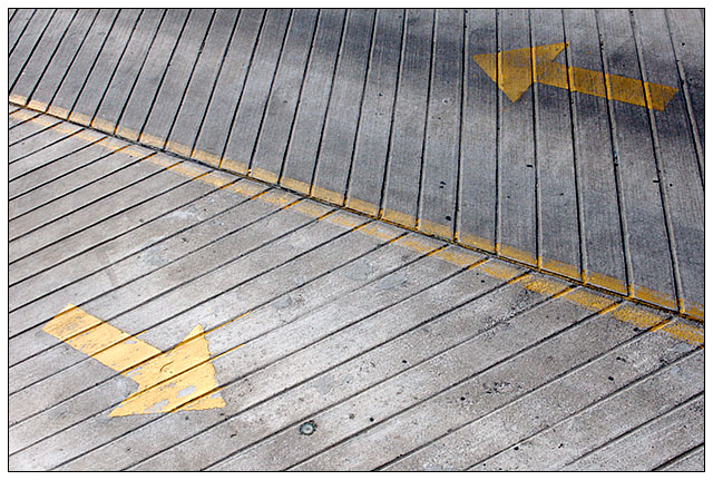
The longer I sit and look at this, the more I begin to think or see the one side with the left arrow, being on a higher plane than the lower section with the right arrow. |
I see what you are saying. This was not really intended, but if that works for you, that's great. This is probably not because of the shadows, but because of the diagnonal line, which may have been an edge, and the smaller lines reaching that edge at different angles. |
|
|
|
07/26/2006 10:16:39 AM |
| excellent entry to lines, design elements perfect & enjoyable composition...... v 9 |
|
| Photographer found comment helpful. |
|
|
07/26/2006 08:29:58 AM |
| I gave you a 7 just for the "fascinatin' rhythm" |
|
| Photographer found comment helpful. |
|
|
07/26/2006 01:40:46 AM |
Actually, there is more dimension than you give yourself credit Arcady.
The longer I sit and look at this, the more I begin to think or see the one side with the left arrow, being on a higher plane than the lower section with the right arrow. Not until the far left side of the image do they seem to have the same lighting and share the same plane.
Great use of shades to add an etxra touch of dimension. |
|
| Photographer found comment helpful. |
|
|
07/26/2006 01:34:27 AM |
Thank you to all who commented!
Originally posted by ShutterPug:
nice angles - good perspective. Seems a bit flat though |
I get this "flat" complaint all the time. This image was *meant* to be 2-dimentional. What's wrong with that? See discussion under this picture for more thoughts on flatness:

Message edited by author 2006-07-26 01:36:15. |
|
|
|
07/26/2006 01:11:29 AM |
Great example of composition and use of non-symmetrical lines to acheive balance.
The weathered paint and overall tones are certainly a plus here.
Great title by the way! |
|
| Photographer found comment helpful. |
Comments Made During the Challenge  |
|
|
07/25/2006 12:55:43 PM |
|
| Photographer found comment helpful. |
|
|
07/24/2006 05:20:28 PM |
| Very good use of the lines, a lot of depth in 2D. 9 |
|
| Photographer found comment helpful. |
|
|
07/23/2006 07:12:59 AM |
| Appealing compozition for abstract photo...would add bit more contrast maybe. |
|
| Photographer found comment helpful. |
|
|
07/22/2006 06:46:46 PM |
| Simple and actually quite elegant....the tones are so nice. |
|
| Photographer found comment helpful. |
|
|
07/21/2006 04:30:03 PM |
| Very nice, I really like this photo. Good eye for this artful composition. |
|
| Photographer found comment helpful. |
|
|
07/20/2006 03:38:37 PM |
| Nice diagonal lines, wish they were a little brighter. maybe some more contrast? |
|
| Photographer found comment helpful. |
|
|
07/20/2006 12:15:11 PM |
| Lines it is...very well done! |
|
| Photographer found comment helpful. |
|
|
07/20/2006 09:59:15 AM |
| The yellow makes the photo pop nice flow to it.good contrast. |
|
| Photographer found comment helpful. |
|
|
07/20/2006 03:33:07 AM |
| like the juxtaposition here-8- |
|
| Photographer found comment helpful. |
|
|
07/20/2006 01:46:11 AM |
| Maybe darken it a wee bit? |
|
| Photographer found comment helpful. |
|
|
07/19/2006 08:13:35 AM |
| nice angles - good perspective. Seems a bit flat though |
|
| Photographer found comment helpful. |
Home -
Challenges -
Community -
League -
Photos -
Cameras -
Lenses -
Learn -
Help -
Terms of Use -
Privacy -
Top ^
DPChallenge, and website content and design, Copyright © 2001-2025 Challenging Technologies, LLC.
All digital photo copyrights belong to the photographers and may not be used without permission.
Current Server Time: 03/14/2025 11:48:23 AM EDT.