| Author | Thread |
Comments Made During the Challenge  |
|
|
07/22/2006 02:29:31 PM |
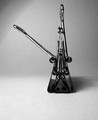
| An interesting place, though I think this image lacks some sophistication really: careful use of curves or levels might have brought out those triangles more clearly, differentiated one from another more - they all tend to the same shade of grey here. The shot feels slightly tilted, which may only be some kind of illusion, but nevertheless is definitely present and without a point that I can find. The writing a bottom of frame draws the eye, but seems annoyingly cut off. |
|
 Photographer found comment helpful. Photographer found comment helpful. |
|
|
07/20/2006 02:12:36 AM |
| Has potential. Needs better lighting. |
|
| Photographer found comment helpful. |
|
|
07/19/2006 10:12:38 AM |
| I like the photo, but I think it needs a little more contrast to separate the different triangle sections. |
|
| Photographer found comment helpful. |
|
|
07/19/2006 09:18:07 AM |
| I think a tad more contrast would accentuate the receding triangles. Could also be sharper. Good idea. |
|
| Photographer found comment helpful. |
Home -
Challenges -
Community -
League -
Photos -
Cameras -
Lenses -
Learn -
Help -
Terms of Use -
Privacy -
Top ^
DPChallenge, and website content and design, Copyright © 2001-2025 Challenging Technologies, LLC.
All digital photo copyrights belong to the photographers and may not be used without permission.
Current Server Time: 03/14/2025 09:28:01 AM EDT.