| Author | Thread |
|
|
08/02/2006 05:46:43 AM |
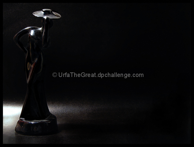
>>... the blue colour gradient across the back ground
This might be possible when your subject is lit by light bulb (yellow light) and the background is not lit by same light. This might confuse your camera to choose white balance for tungsten (did I spelled it right?) light and thus giving blue tinge to background.
Well, you seriously don't need to have studio for "studio shots". All you need is plain background (any wall or cloth will do) and creative lighting. All I use in my studio shots (and their are enough in my portfolio) is light from simple light bulb hanging on free cable (so that I can move it to position ogf my choice). Sometimes computer monitor can also serve as very creative and different background.
Anyway, this is good try. Black on black is a difficult situation. You also need to work on placement of your subject. Check out on rule-of-thirds.
Photoshop is great, but its not easy. Fiddle with Picasa before getting into local editing with photoshop. I still manage 90% (or even more) of my processing on Picasa.
Message edited by author 2006-08-02 05:47:48. |
|
 Photographer found comment helpful. Photographer found comment helpful. |
Comments Made During the Challenge  |
|
|
08/01/2006 05:02:37 PM |
| Black was probably not the best color to choose. This is too dark for me. |
|
| Photographer found comment helpful. |
|
|
08/01/2006 03:55:13 PM |
|
| Photographer found comment helpful. |
|
|
08/01/2006 03:19:46 AM |
|
| Photographer found comment helpful. |
|
|
07/29/2006 07:10:56 AM |
| bit noisy in the background |
|
| Photographer found comment helpful. |
|
|
07/28/2006 02:13:53 AM |
| Another entry used Black on Black really effectively. This one without the title would be difficult to discern. 5 |
|
| Photographer found comment helpful. |
|
|
07/27/2006 02:22:11 PM |
|
| Photographer found comment helpful. |
|
|
07/27/2006 01:49:23 PM |
| i would've like to have more light on the subject. the darkness strains the eye |
|
| Photographer found comment helpful. |
|
|
07/27/2006 07:39:31 AM |
| Cute and artistic...decent photo for on the wall. |
|
| Photographer found comment helpful. |
|
|
07/27/2006 01:09:52 AM |
| Like the graininess where the white fades into black. Specular highlights on figurine are a little too bright on breast. |
|
| Photographer found comment helpful. |
|
|
07/26/2006 06:27:24 PM |
Pretty and simple.
There seems to be a little bit of sensor dust but it doesn't really affect it.
I like this.
And the single source lightning is gorgeous. |
|
| Photographer found comment helpful. |
|
|
07/26/2006 09:46:52 AM |
| I usually hate photographs of sculpture, but this has a mystique, with the light you used. Nice use of negative space. |
|
| Photographer found comment helpful. |
|
|
07/26/2006 07:43:56 AM |
| fits better into the other challenge |
|
| Photographer found comment helpful. |
|
|
07/26/2006 12:42:26 AM |
| hmm, I think you may have submitted this into the wrong challenge |
|
| Photographer found comment helpful. |
Home -
Challenges -
Community -
League -
Photos -
Cameras -
Lenses -
Learn -
Help -
Terms of Use -
Privacy -
Top ^
DPChallenge, and website content and design, Copyright © 2001-2025 Challenging Technologies, LLC.
All digital photo copyrights belong to the photographers and may not be used without permission.
Current Server Time: 03/12/2025 03:02:12 PM EDT.