| Author | Thread |
Comments Made During the Challenge  |
|
|
08/01/2006 02:54:00 AM |
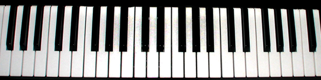
| i like the narrow crop very much, but the curvature from the lens, and also the slightly wonkiness of the keyboard lessens the impact a bit. also, the middle keys seems to have grey splodges (might be my screen though) - needs a bit of noidr reduction. very nice concept though. 4. |
|
 Photographer found comment helpful. Photographer found comment helpful. |
|
|
07/30/2006 09:27:07 PM |
|
| Photographer found comment helpful. |
|
|
07/29/2006 08:52:17 PM |
Several folks have taken pictures of piano keys for this challenge. Look around for other ideas.
This angle is too dead-on for it to hold my interest. |
|
| Photographer found comment helpful. |
|
|
07/29/2006 04:44:55 PM |
| This meets the challenge, but lacks originality. |
|
| Photographer found comment helpful. |
|
|
07/29/2006 12:56:42 AM |
| i'd like to see more of the title in this...its a little off kilter and the lines are too strong for my tastes, perhaps from the side? |
|
| Photographer found comment helpful. |
|
|
07/27/2006 10:46:15 AM |
| It's certainly black and white but not very compelling as far as composition goes. |
|
| Photographer found comment helpful. |
|
|
07/26/2006 04:26:15 PM |
| Not enough focus. There is a slant to it. A closer up shot may have been better. |
|
| Photographer found comment helpful. |
|
|
07/26/2006 09:33:46 AM |
| Next time try a different angle, the picture might gain a very beautiful meaning. |
|
| Photographer found comment helpful. |
|
|
07/26/2006 02:05:13 AM |
|
| Photographer found comment helpful. |
Home -
Challenges -
Community -
League -
Photos -
Cameras -
Lenses -
Learn -
Help -
Terms of Use -
Privacy -
Top ^
DPChallenge, and website content and design, Copyright © 2001-2025 Challenging Technologies, LLC.
All digital photo copyrights belong to the photographers and may not be used without permission.
Current Server Time: 03/12/2025 08:19:43 PM EDT.