| Author | Thread |
|
|
08/07/2006 05:55:46 PM |
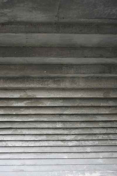
| fyi 6...... am impressed with this submission. A basic idea but creative thinking w/ good pattern and b to w tonality. A curious title - as under the bridge does not seem to be visually evident. The gradient idea seems like it could be possible to be a good concept for a design challenge. I enjoyed this one. |
|
Comments Made During the Challenge  |
|
|
07/31/2006 11:40:54 PM |
| Clever title and it fits the topic. |
|
|
|
07/30/2006 08:39:23 PM |
| LOL!! Quite funny, but lacking in contrast. :-) |
|
|
|
07/30/2006 02:08:45 PM |
|
|
|
07/28/2006 08:15:32 PM |
| Exposure is good but it's hard to get a sense of what this is or the scale of it. |
|
|
|
07/27/2006 05:02:52 PM |
| Is this the underside of a bridge? Very cool point of view. |
|
|
|
07/26/2006 12:50:41 PM |
I like the idea here, I think if there was more of the bottom or the bridge (I'm pretty sure that's what this is...) it might've made a bigger impact just so it was easier to tell what it was. Definitely meets the challenge.
Just my 2 cents :) |
|
Home -
Challenges -
Community -
League -
Photos -
Cameras -
Lenses -
Learn -
Help -
Terms of Use -
Privacy -
Top ^
DPChallenge, and website content and design, Copyright © 2001-2025 Challenging Technologies, LLC.
All digital photo copyrights belong to the photographers and may not be used without permission.
Current Server Time: 03/12/2025 02:25:54 PM EDT.