| Author | Thread |
Comments Made During the Challenge  |
|
|
07/28/2002 10:10:00 PM |
| the lighting here is really harsh and it detracts a lot from the shot. |
|
|
|
07/26/2002 02:14:00 PM |
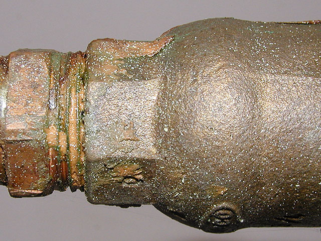
| I really liked this picture when I saw the thumbnail but the full-size image seems to be over-sharpened. Either that, or there is powdered sugar on the pipe. But I do like the hammered-like texture on the right side pipe. *5* -balynch |
|
|
|
07/26/2002 09:56:00 AM |
| check out the spider webbing underneath. a close up of that wouldve been cool or some integration with it if it was possible good job though |
|
|
|
07/26/2002 08:56:00 AM |
| The photo looks a tad overexposed. While it conforms to the theme "texture", I do not see anything interesting to it however. |
|
|
|
07/25/2002 02:21:00 PM |
| Those white specks read more like noise than metal? You should have given more on the left because it was just going into a new shape and would have made the picture more interesting and cropped out more on the right. |
|
|
|
07/24/2002 04:51:00 PM |
Composition8
Originality9
Technical Aspects9
Meets Challenge8
Total Score9
For those that are just learning, like me.
Composition: Scoring in this area is based on basic composition of a picture and includes the rule of thirds, balance, cropping, and curved and diagonal lines. Subject matter that does not lend itself to the picture or otherwise unwanted is also considered here.
Originality: Scoring in this area is based on pictures or concepts that I have seen, as well as how much effort you have invested in the picture. Usually a little something that sets it aside from a snapshot. Does it make me want to come back for another look? You know things like that.
Technical Aspects: Focus, exposure, lighting, and other special effects (done by the camera), and post processing are all considered in this category.
Meets Challenge: This is based on my interpretation of if you, have/have not, met the challenge. This is fairly simple but quite important for this site.
There are many sites that can give you assistance in achieving better skills in photography, but I think the best way to learn is to take pictures and show them to other people. Believe me when it is a good one you will know it.
Good luck!
Autool
|
|
|
|
07/24/2002 02:28:00 PM |
| For me, I think tilting the pipe one way or the other would have made it more dynamic. The way it is, it seems kinda static. karmat |
|
|
|
07/24/2002 07:28:00 AM |
| too much flare/reflection - try with natural, more difused light. Also, central position is not the best. |
|
|
|
07/23/2002 09:47:00 AM |
| good texture... the light seems a bit bright though... = 5 - jmsetzler |
|
|
|
07/23/2002 07:37:00 AM |
| looks to me like your flash was a bit too strong for this shot. apart from that, good texture. 5 beegee |
|
|
|
07/23/2002 01:49:00 AM |
| The exposureon this is a bit bright. |
|
|
|
07/22/2002 11:13:00 PM |
| lighting is distracting. need light source more from side to bring out the texture more with shadows |
|
|
|
07/22/2002 06:47:00 PM |
| I like the colors. Lighting is a bit strong. |
|
|
|
07/22/2002 09:53:00 AM |
| The white speckles really kill this. ytou need to use reflected light on something like this. |
|
|
|
07/22/2002 03:11:00 AM |
| good idea for a texture. looks like you shot the flash directly into the metal to get it to bounce back and reveal the texture. not a bad idea, but I am bothered by really bright reflection. to get rid of that, you could try lighting it from the bottom or side to reveal the texture through shadows instead of reflections. |
|
Home -
Challenges -
Community -
League -
Photos -
Cameras -
Lenses -
Learn -
Help -
Terms of Use -
Privacy -
Top ^
DPChallenge, and website content and design, Copyright © 2001-2025 Challenging Technologies, LLC.
All digital photo copyrights belong to the photographers and may not be used without permission.
Current Server Time: 03/12/2025 07:41:56 PM EDT.