| Author | Thread |
|
|
08/11/2006 12:55:22 AM |
Originally posted by jaded_youth:
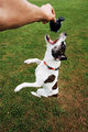
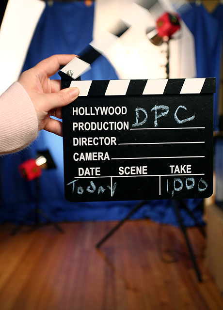
didnt want to cut off the top of the clapboard but there was a very distracting light fixture up there and I couldnt seem to angle it out and still get the shot I was looking for. |
I think I'd have tried to keep exactly the same angle and setup, but bring the board closer until it could all fit.
The board says it all for this challenge, and I think you could get away with a lot less background showing around it. Great idea -- I have access to one of those boards, and I never even thought of it for this ... (but I might now!) |
|
 Photographer found comment helpful. Photographer found comment helpful. |
|
|
08/10/2006 03:11:43 PM |
I think you found the weakest point yourself. The blur of the clapboard (nicely done BTW in hold the rest still) is lost in the white background. Therefore the best effect of the shot is lost. :(
Otherwise the composition is nice (if not a bit centered). The lighting is good (except those white background highlights). The focus is great. The blur is also great. Since we were looking for "action" and since it was lost in the background, I can see why you got voted lower, but with a nicely color background I bet this would have done much better. |
|
| Photographer found comment helpful. |
|
|
08/09/2006 06:50:38 AM |
Hey Crystal,
I gave this one a 5, so I'll approach your critique request as I do any others on here.
Camera Work/Technical: Excellent. This is what pulled all five points in my opinion. I like the colors you set up, as they all work well to make the image pop. I like the slower shutter speed to get movement in the clapboard, and the clapboard itself is tack sharp. Your chosen depth of field works nicely to isolate most of your subject off of the background. The only exception is the white stripes in the clapboard.
Lighting: The umbrella and softbox are difficult to make out, thus they just look overexposed without studying the image closely for a period of time.. In turn, these really compete for the eye's attention and work as a large distraction. Keep in mind that the voter only spends a few seconds on each image, especially when there are so many images in a challenge. In addition, the white lines of the clapboard itself just fade into the white of the lighting, and you lose more of the needed detail.
Composition/Content: I got a real fell of movement from the clapboard, but it just wasn't the "action" I had in mind. I do think that it is creative, but it came across more as a cute snapshot than a strong technical photograph. It also feels a little cramped into the frame. Perhaps just a bit wider view would have also helped out, but it already looks like you were losing the backdrop on the right side, as I see a doorway or something bright.
My Opinion: I do like the idea, but it just wasn't what my mind had imagined for an action shot. Even still, turning that softbox, using a dark umbrella and pulling back a hair would have probably pulled a 6 from me. I hope that this helps. |
|
| Photographer found comment helpful. |
|
|
08/09/2006 06:43:22 AM |
| Sometimes there's just no good explanation for a score - I didn't vote in this challenge but it would have been at least a 6 from me, probably a 7 for the creativity. Nice color in the background with the red/white/blue theme, and I really like the action of the board. You did indeed keep the board itself is sharp focus while moving the top and using a 1/8 sec shutter speed! Composition is fine, exposure is very good. I think the only thing I find somewhat detracting (and I'm not sure why) is the sleeve of the sweater and maybe the white part on the left that's "growing" out of the sleeve. Really a clever, well executed shot. |
|
| Photographer found comment helpful. |
Comments Made During the Challenge  |
|
|
08/08/2006 06:42:17 PM |
| You make me smile. Good joke! 7 |
|
| Photographer found comment helpful. |
|
|
08/07/2006 05:38:17 PM |
|
| Photographer found comment helpful. |
|
|
08/07/2006 01:19:58 AM |
|
| Photographer found comment helpful. |
|
|
08/06/2006 12:16:55 AM |
|
| Photographer found comment helpful. |
|
|
08/04/2006 08:20:40 PM |
|
| Photographer found comment helpful. |
|
|
08/03/2006 06:14:18 PM |
| Cute idea. I think less floor and not cutting off the top of the sign would have improved the composition a bit here. |
|
| Photographer found comment helpful. |
|
|
08/03/2006 05:26:02 PM |
|
| Photographer found comment helpful. |
|
|
08/03/2006 02:15:45 PM |
|
| Photographer found comment helpful. |
|
|
08/03/2006 09:00:55 AM |
| Unique! Great dof. :) LOVE the picture. |
|
| Photographer found comment helpful. |
|
|
08/02/2006 01:55:38 AM |
| I figured someone had to pull this idea out, but you still incorperate the other action in the shot. I really like it. |
|
| Photographer found comment helpful. |
Home -
Challenges -
Community -
League -
Photos -
Cameras -
Lenses -
Learn -
Help -
Terms of Use -
Privacy -
Top ^
DPChallenge, and website content and design, Copyright © 2001-2025 Challenging Technologies, LLC.
All digital photo copyrights belong to the photographers and may not be used without permission.
Current Server Time: 04/27/2025 03:44:37 AM EDT.