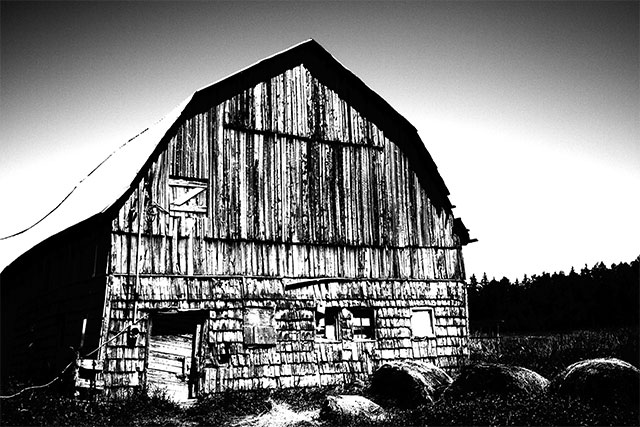
This is a modified version of another photo for the B&W High Contrast technique group. Wasn't originally taken with high contrast in mind, but I thought I'd just tinker around with one of my shots to see what I could come up with.
This is the original shot taken from the camera without any editing, except conversion from RAW to TIF...
It could be adjusted in colour for a nice photo, but I decided to try changing it to B&W using the Channel Mixer method like so...
I played around with some of the other settings like Levels, Contrast and Saturation, but all I ended up using was a major Curves adjustment...
Also used some USM giving me the final product.
Definitely more extreme than most of the other examples in the thread so far, but I really liked how it came out. The gradient in the sky was kind of a surprise, but I don't really mind it. This whole process took me maybe 10 minutes so I'm sure with some further tweaking (and perhaps some actual skill in PS) it could be better.
First, thanks for the terrific explanation and links to the other shots! That's a terrific tool for helping others follow along.
I think this particular photo is a great example of what the various versions do for you. Of course, you start from a nicely composed, nicely exposed, nicely focused shot. Let's not forget the fundamentals here.
Here's my reaction to each shot:
Color: an old barn, but not especially decrepit. It's a nice day, enjoying some time in the country. Emotion: calm, happiness, generally enjoying life. It might benefit from some higher contrast, but not to extremes. Details I'm drawn to: the shape of the barn against the sky, a little texture in the barn, the hay bales.
Initial B&W: kind of bland; while in the color version the sky contrasted with the barn and the ground, here they all kind of blend together. Emotions: tired, end of day, ready to go home. I notice the sky darkening in a way I didn't in the original, which suggests the end of the day to me. I realize intellectually that it's just the usual sky lightening near the horizon, but emotionally, that's the effect. Details I'm drawn to: not much, actually. Mostly the shadow line under the roof.
High contrast B&W: ZAP! I immediately zoom in on the textures in the wood, the way the loft door stands out against the grain, and how the main door is falling off its hinges. The sky seems ominous now. The hay bales fade out of view. The barn's upper wood stands out against the lower stones. I wonder what's hidden in that shadow on the left and over in the very dark woods. Emotions: a little afraid, like the barn's probably haunted. And the sky makes me worry a storm's coming. Finally I feel a little sad for this barn that's falling apart.
I'm not saying the high contrast version is better than the color version, necessarily. It just conveys different things, and the high contrast version affects me more strongly. The initial B&W is definitely the "tamest" of the three, and wouldn't hold my interest for very long.
Great Job illustrating the progression of your processing. i'm not good at that. cant figure out the screen shots either. I don't however like the way the roof looks anymore but I love the rest of it. maybe mask of the roof a little? The original does have a little detail. some lines on it. just a thought.