| Author | Thread |
|
|
08/07/2006 11:30:49 AM |
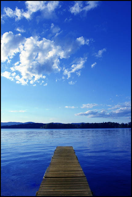
| I would have liked it better if you were way lower to the dock, but with more or less the same composition. Great Job either way. I gave you a 7. |
|
Comments Made During the Challenge  |
|
|
08/06/2006 12:33:06 AM |
| A bit over-saturated for me. Nice though. 5 |
|
|
|
08/05/2006 08:59:05 PM |
| Love these kind of pictures... t.i. the bridge going to the sea like you could walk on the sea :o)Love the blue colors, good picture.. Very peaceful.. |
|
|
|
08/03/2006 02:00:40 PM |
do not pinch the world
with your eyes. 4 |
|
|
|
08/03/2006 08:02:46 AM |
|
|
|
08/02/2006 09:50:20 AM |
First impression: The colors are not right. The water is to blue. Most of the frame is filled with the sky but the title is about the water.
Things that would improve the score: Rethink the composition and the pov. I'm thinking that a lower pov would make the pier more dominant in the picture. Maybe a more subtle color enhancement in post processing. What really throws me off is the difference in the color cast of the pier and the water. If the sky and water was that blue, the pier would also carry a blue tint. It looks greenish to me. I think that's why the water looks to blue. |
|
|
|
08/01/2006 02:46:58 PM |
| I like this very much. This is a valid case for a centered composition. Works well. I think you went a bit overboard on the blue saturation however. Good luck in the challenge. |
|
|
|
07/31/2006 07:08:47 PM |
| 6: nice blues and good leading line but the horizon doesnt look right - even though it seems to be level! |
|
|
|
07/31/2006 12:46:18 PM |
| Wonderful colors! Great shot! |
|
Home -
Challenges -
Community -
League -
Photos -
Cameras -
Lenses -
Learn -
Help -
Terms of Use -
Privacy -
Top ^
DPChallenge, and website content and design, Copyright © 2001-2025 Challenging Technologies, LLC.
All digital photo copyrights belong to the photographers and may not be used without permission.
Current Server Time: 03/15/2025 05:31:48 AM EDT.