| Author | Thread |
|
|
09/01/2006 01:52:23 PM |
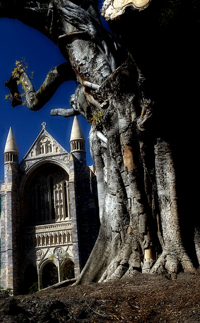
| good use of perspective, its a shame some of the tree's limbs were cut off |
|
 Photographer found comment helpful. Photographer found comment helpful. |
Comments Made During the Challenge  |
|
|
08/14/2006 08:51:19 PM |
| that three is almost scary, it's so big! great composition. |
|
| Photographer found comment helpful. |
|
|
08/14/2006 03:39:59 PM |
| Just rotate it 0.5 degrees clockwise |
|
| Photographer found comment helpful. |
|
|
08/14/2006 05:14:07 AM |
| I would have given one more point if it were level. 6 as it is. |
|
| Photographer found comment helpful. |
|
|
08/13/2006 11:31:35 PM |
| nice composition, but a little too dark |
|
| Photographer found comment helpful. |
|
|
08/13/2006 03:22:26 PM |
| Tree texture is interesting. Would like to see more shadow detail. |
|
| Photographer found comment helpful. |
|
|
08/12/2006 12:34:00 PM |
| beautiful tree. photo does feel a bit crowded however. |
|
| Photographer found comment helpful. |
|
|
08/11/2006 06:50:39 AM |
| I often worship under trees too! It seems like it's tilted to the left too much - maybe on purpose? Brightest Blessings to you and good luck! 9 |
|
| Photographer found comment helpful. |
|
|
08/10/2006 06:42:05 AM |
| this picture has such a gothicfeel to it. and im not just talking about the struckture.the tree in its gnarly present gives alot of feeling and texture. |
|
| Photographer found comment helpful. |
|
|
08/10/2006 04:58:25 AM |
| Great colors, scary atmosphere! |
|
| Photographer found comment helpful. |
|
|
08/10/2006 02:35:11 AM |
| Shame about the shadowing of the Church/School/castle but good anyway |
|
| Photographer found comment helpful. |
|
|
08/09/2006 01:13:35 PM |
I really like the components of this image, the building and the tree. Just two small things I'd say, and I took a quick look at the rules for basic editing to make sure they were doable.
Firstly, there is a fair amount of lean that could easily be corrected by rotating the picture, and secondly I'd be interested to see what the image would look like in B & W, since its very much in monochrome already. |
|
| Photographer found comment helpful. |
|
|
08/09/2006 11:41:52 AM |
| I like the shades, but I would've altered the tilt a bit, so it would be more straight. |
|
| Photographer found comment helpful. |
|
|
08/09/2006 08:16:36 AM |
| Cool, dramatic photo...really lots of contrast but I like it. |
|
| Photographer found comment helpful. |
Home -
Challenges -
Community -
League -
Photos -
Cameras -
Lenses -
Learn -
Help -
Terms of Use -
Privacy -
Top ^
DPChallenge, and website content and design, Copyright © 2001-2025 Challenging Technologies, LLC.
All digital photo copyrights belong to the photographers and may not be used without permission.
Current Server Time: 03/10/2025 07:22:43 PM EDT.