| Author | Thread |
Comments Made During the Challenge  |
|
|
08/17/2006 04:52:56 PM |
| Sorry just not workign for me. doesn't seem in focus, the background is bad and the colors just aren't working. |
|
 Photographer found comment helpful. Photographer found comment helpful. |
|
|
08/17/2006 03:28:18 PM |
Nice looking cans. ;^) Several things holding this image down; 1) tossed together backdrop is wrinkled and messy looking, 2) the image is flat and really needs some additional contrast added, 3) is the backdrop white? if yes, you need to set the B/W points, and 4) lighting is off or a levels adj is needed - looks underexposed, yet there is light glare on the cans...
Best of luck to you in this and future challenges. |
|
| Photographer found comment helpful. |
|
|
08/17/2006 05:46:13 AM |
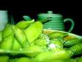
| Lacks contrast, very muddy. Peas are too dark. Odd color cast. |
|
| Photographer found comment helpful. |
|
|
08/16/2006 12:44:51 PM |
| Needs a lot more contrast. |
|
| Photographer found comment helpful. |
|
|
08/15/2006 07:15:10 PM |
| I can tell you put some effort into the planning and staging of this image. First, the image suffers a little from the black and white conversion performed. You did a nice job of keeping the lettering on the cans from blowing out but the image has mostly darks and lights with very little grey in between. If you have Photoshop or Paint Shop Pro, I would suggest your read Fotomann�s B&W tutorial (Learn menu � Tutorial link). I also think the image would have benefited from a smoother background. This type of photo works well when you use a single piece of poster board or heavy card stock for the base and background. |
|
| Photographer found comment helpful. |
|
|
08/15/2006 06:11:06 PM |
| The set up would have been much better had you straightened out the backdrop and perhaps used the same material under your props as well. Not sure about the colour overlay, it definitely washes out any good tonality that may otherwise have scored you extra points here. |
|
| Photographer found comment helpful. |
|
|
08/15/2006 05:50:48 PM |
| I like your setup and the cans themselves, but the background is distracting me. There also seems to be a mist or haze over the picture, and I'm wondering if that was intentional. It doesn't completely work for me if it was; I would have been tempted to use levels or curves to bump up the contrast. |
|
| Photographer found comment helpful. |
|
|
08/15/2006 05:47:30 PM |
| I find this a little too dark. It's hard to focus on the peas, because you can hardly see them |
|
| Photographer found comment helpful. |
|
|
08/15/2006 11:38:09 AM |
| bad contrast and background. |
|
| Photographer found comment helpful. |
Home -
Challenges -
Community -
League -
Photos -
Cameras -
Lenses -
Learn -
Help -
Terms of Use -
Privacy -
Top ^
DPChallenge, and website content and design, Copyright © 2001-2025 Challenging Technologies, LLC.
All digital photo copyrights belong to the photographers and may not be used without permission.
Current Server Time: 03/13/2025 12:59:38 AM EDT.