| Author | Thread |
Comments Made During the Challenge  |
|
|
08/15/2006 03:09:23 AM |
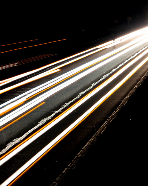
| Neat shot. I particularly like the fact that you can make out some detail in the road surface. Good job! |
|
|
|
08/14/2006 08:48:13 AM |
| i'd have cropped this more square from the bottom, keeping the same width. the brighter lights in the corner are a major distraction, and the top left orange lights don't really fit in. otherwise, it's a reasonably striking abstract shot; and the title is a rather lovely choice. but for me, overall, it leaves me a bit cold. sorry. 4. |
|
 Photographer found comment helpful. Photographer found comment helpful. |
|
|
08/14/2006 01:21:18 AM |
|
|
|
08/13/2006 02:11:07 AM |
| This is one of those ideas that has been done so many times that you have to do something pretty amazing to impress people with it. I wasn't awed. Sorry. =( |
|
|
|
08/11/2006 10:34:48 PM |
|
|
|
08/11/2006 09:58:00 AM |
| Very nice...I like it a lot. Thanks for being creative! 10 |
|
|
|
08/11/2006 04:56:16 AM |
|
|
|
08/09/2006 10:39:39 PM |
| Cool pic, just a little to subjectless. |
|
|
|
08/09/2006 05:12:54 AM |
| Nice constasts I think it would have been better landscape though |
|
|
|
08/09/2006 04:29:44 AM |
| Nice effect! Funny, I almost entered something quite similar - or at least same idea, but I went for something totally different in the end. I like the sharp division between the stark white and strong yellow lines. I'm not crazy about the upper right portion of the image, but it could be that if I stared at it much longer, I'd grow to love it ;-) The angle is another thing I like. |
|
| Photographer found comment helpful. |
Home -
Challenges -
Community -
League -
Photos -
Cameras -
Lenses -
Learn -
Help -
Terms of Use -
Privacy -
Top ^
DPChallenge, and website content and design, Copyright © 2001-2025 Challenging Technologies, LLC.
All digital photo copyrights belong to the photographers and may not be used without permission.
Current Server Time: 03/14/2025 03:49:27 AM EDT.